Path Tables
Earlier this year I was presented with a rare and rich opportunity. As Path positioned itself as an app studio, I had the chance to foray into unexplored territory, push the limits and boundaries and ignore all preconceived notions about Path’s existing products. My task: go far, wide, deep, narrow, try everything, think through everything, make a bunch of prototypes, see what sticks. Essentially, brainstorm and build several exerimental products off of those ideas.
Last year, Path acquired a startup called TalkTo, and shortly afterwards, released Path Talk Places. As a brief overview of that product: you could text any business any question, common examples being setting up an appointment or finding out if something is in stock.
Although many times it felt like magic, the problem with the way the platform was structured is the user had to know exactly which business to ask before he or she could ask anything in the world. If I want to buy house paint in San Francisco, I couldn’t just text into an empty field “where can I buy house paint in San Francisco,” I’d have to instead text several hardware stores and ask if they carry it. The product was better suited to asking a specific question like “what time do you close” or “do you have fresh Japanese uni tonight? You do? Okay, I’d like to make a reservation” for a specific restaurant.
I collaborated with Dave and the TalkTo team to brainstorm solutions to the specificity issue. Did we need to go all the way into abstraction? What if the solution was to go ultra-specific? We had access to something that Dave calls “The Human Cloud,” which was the team of phone agents brought on with the TalkTo team. This was the underlying infrastructure to Place Messaging, and it was the basis for all of the experimental projects we built under one umbrella.
I’ll do a deep dive into one specific project that came out of this. Tables started out as a side project for Riley Crane, an engineer from the TalkTo team, with whom I worked very closely. Riley came to me with a fully functioning, mostly-built web app and asked if I could help him with another perspective, poke holes in the user flow, and make it look nicer.
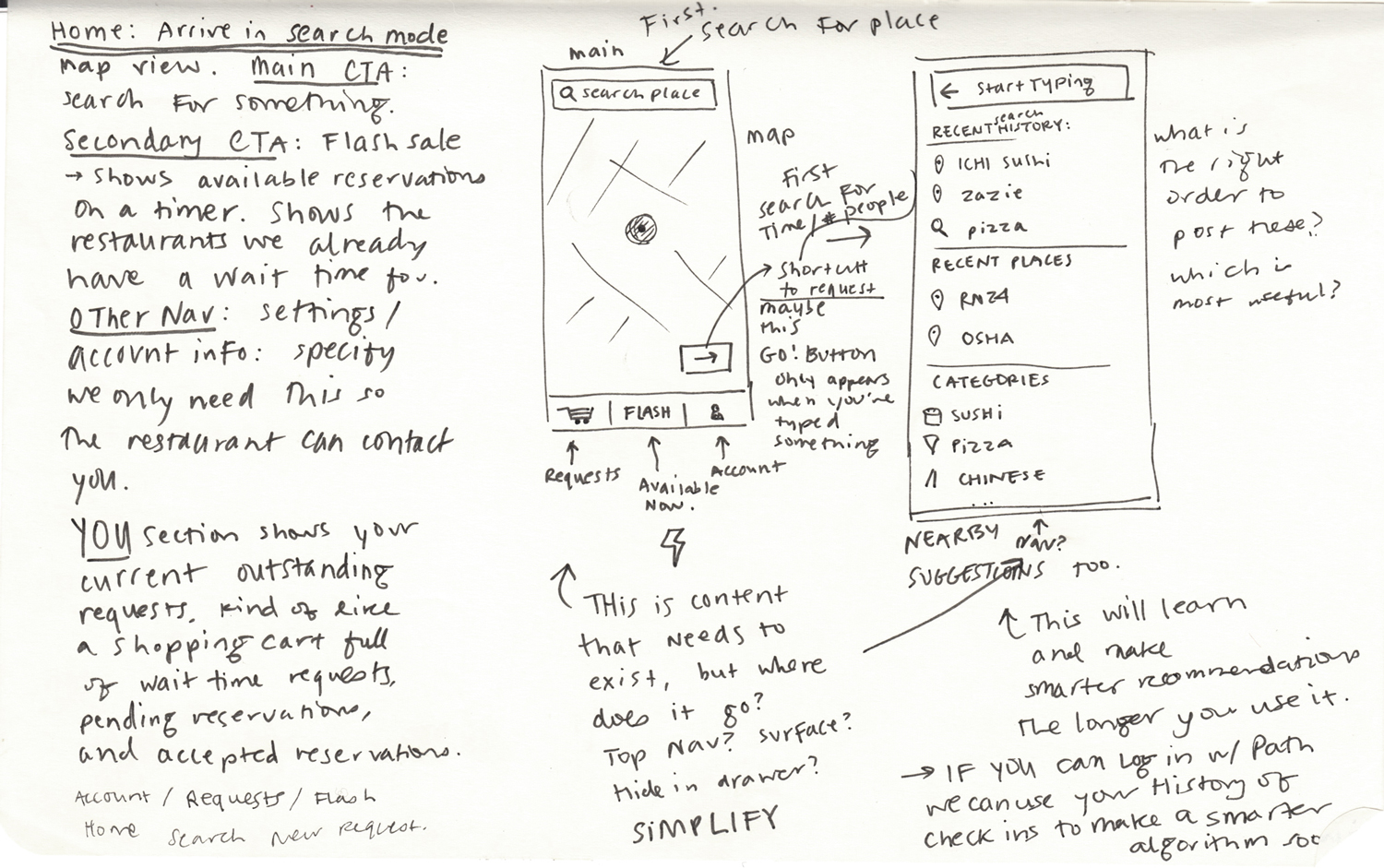
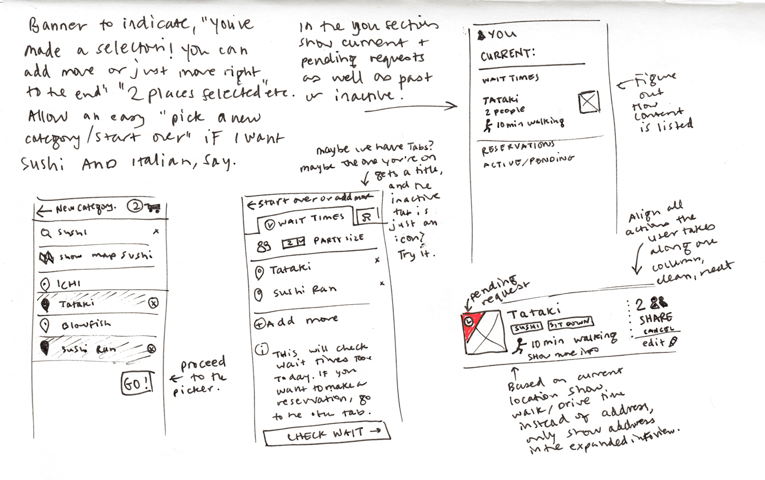
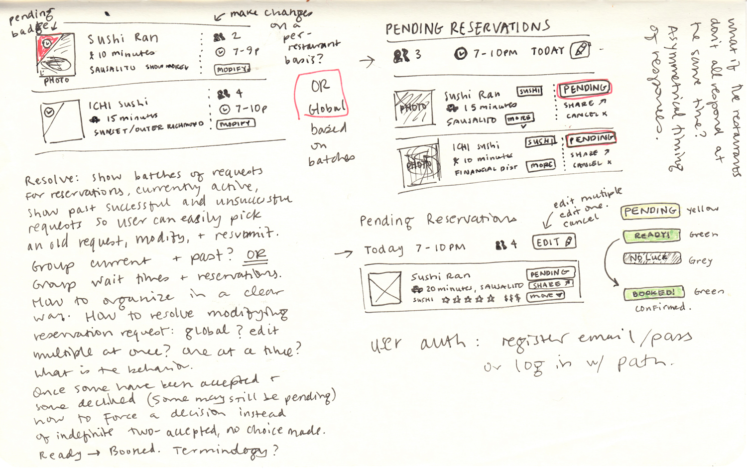
I started by doing a run through the product with him as he talked through his goals. This would be a product more for the power user, people who want to be able to cast a wider net and receive back several positives, rather than picking one restaurant at a time. It was both reservations and wait times.
By starting on paper, I was able to take note of all the things I noticed as I progressed through Riley’s app, then touch base with him and make sure we were on the same page about the goals for the user.
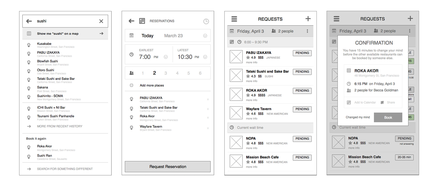
I have a love-hate relationship with Balsamiq. It’s dreadful, but it’s the best tool ever in a certain scenario. When my goal is to iterate as quickly as possible, and get all of my ideas out without having the chance to edit or be a perfectionist, Balsamiq is perfect. It has the added bonus that no one questions visual design choices because it is clearly so ugly there’s no way it will look like that later. I love being able to quickly drag and drop boxes and icons (even if they are completely wrong) just to get a sense of how much content will fit on one page, where do we need to slow down and really make sure the user understands everything, and where is it fine to quickly gloss over something to get the user through as quickly as possible. There’s no better way to figure out where the holes in a product flow are than by slapping them out in a wireframe.
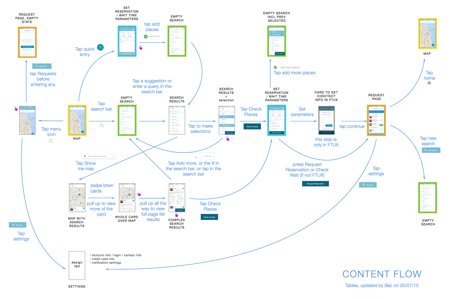
I was about halfway through the first iteration of high fidelity when one of my engineers asked me to explain where certain actions led. When 90% of your team is remote, clear communication is incredibly valuable. Time zones factor in to articulating every detail so that we could be on the same page. I put more effort into static mocks than I normally would when I could walk up to each engineer and discuss things on the spot.
Taking the time to make a thorough content map at this stage was extraordinarily valuable. We’d had enough time to progress through the product that we could more easily see how it all fit together. I like to think of the user flow scenarios as that stereotypical hallway in Scooby Doo where they’re all running and there are 30 doors but they all end up leading you back to the same place. There are many different approaches to the same goal. This also was a great way to see which parts of the product needed further attention and development.
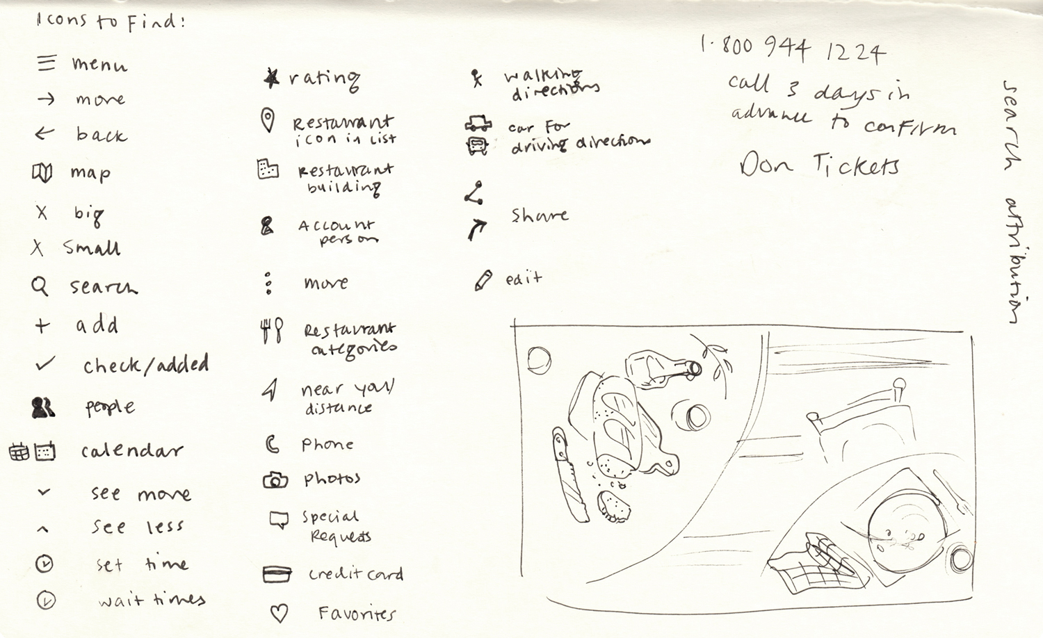
Once in a while I get to draw my own icon library. I’d been browsing around for a while and wasn’t satisfied with any icon sets I was finding, and Path doesn’t have a dedicated icon designer like some larger companies. I combed through the product and wrote down every instance where I had indicated an icon would help clarify content to a user and batched them into categories. As this was just a prototype / proof of concept, I kept the color palette limited and simple. The goal here was to make sure the user fully understood the flow. I didn’t want to put too much emphasis into visual design when usability was our priority for v1.
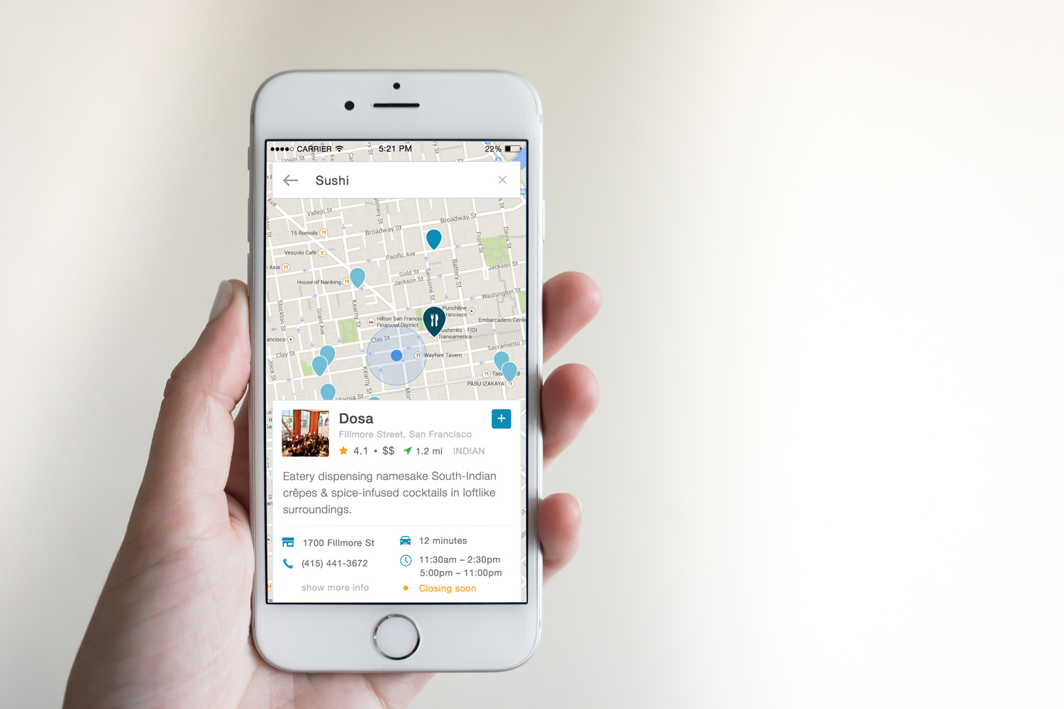
Though the main path through Tables is the simple list view, there are some users who would prefer to collect more information before making a decision. When deciding where to eat, not everyone has an encyclopedic memory of all restaurant criteria in their heads. If a user taps on show me “sushi” on a map, he or she can have access to a detailed list view. I quickly sketched out the concept for this and Riley and I discussed the backend implications as well as how to subtly influence the user with motion design.
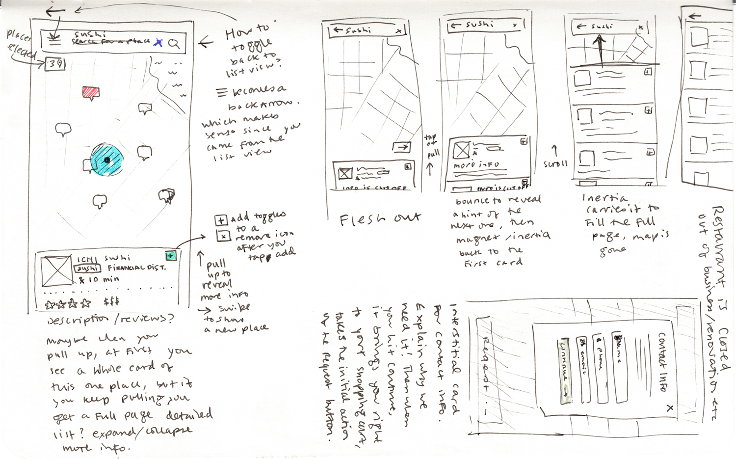
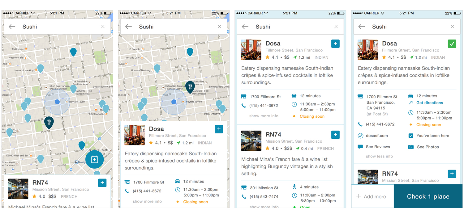
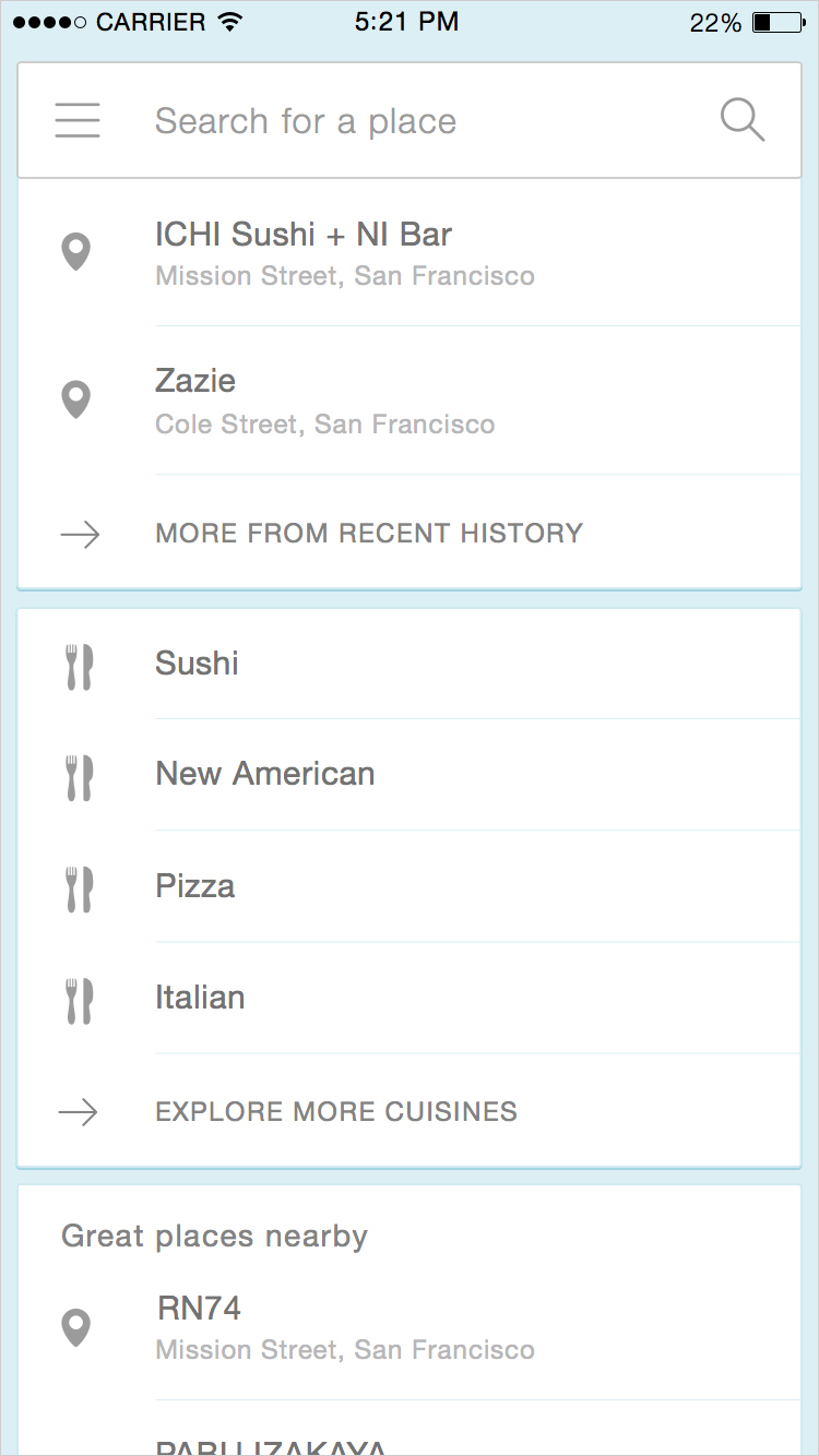
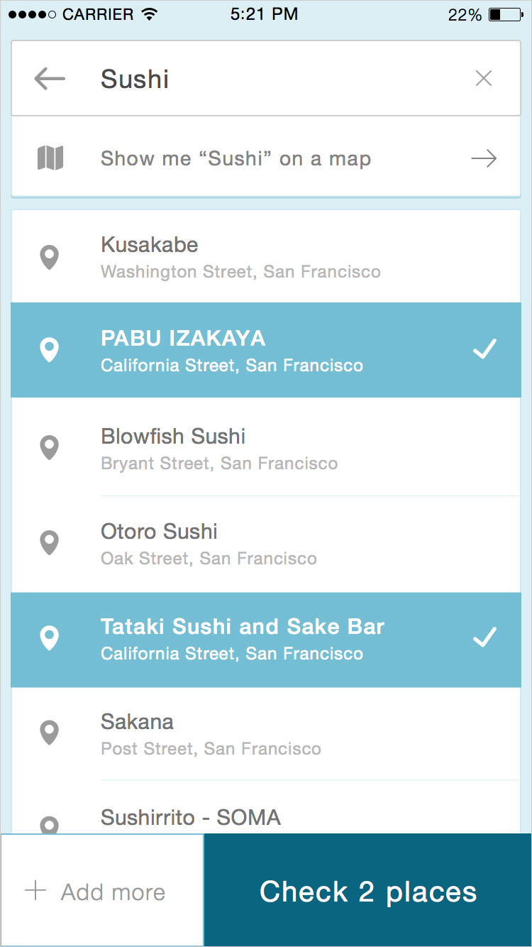
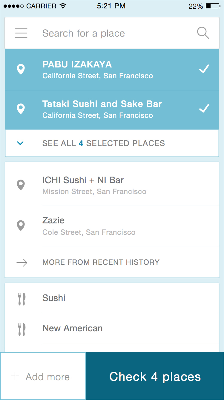
In the map view, a user can swipe between cards to keep the full map view. I deliberately cropped the card in an uncomfortable place to indicate there is more content. If the user pulls up on the card, it bounces a bit further to reveal a full set of cards stacked in a list. When the user pulls up to see more, the card moves with inertia, magneting itself to the search bar at the top, the background fading to solid. The search bar and buttons are fixed, the cards scrolling behind it. This allowing the user to see more information to help make an informed choice where to eat. Scrolling past the top returns to the map.
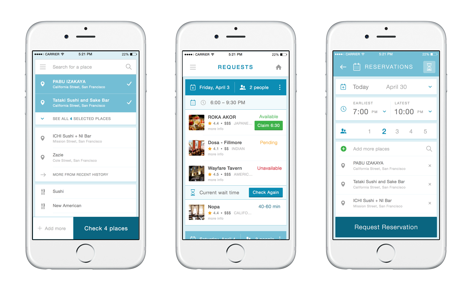
A typical flow brings the user through the simple list view. In this instance, a user selected sushi from the cuisine card, made a few selections, then tapped “add more.” This brought the user back to the search results without dropping the previous selection. The user can then proceed to pick a new category before casting the batch into the request page.
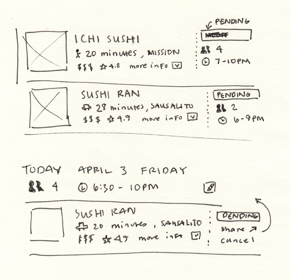
Sometimes when I’m already pretty far into high fidelity, it helps to come back to paper and discuss possibilities in a less formal setting. The more Riley and I worked together, the easier it became to iterate on the spot. We spent a great deal of time discussing how best to display the complex, time-sensitive information on the request page.
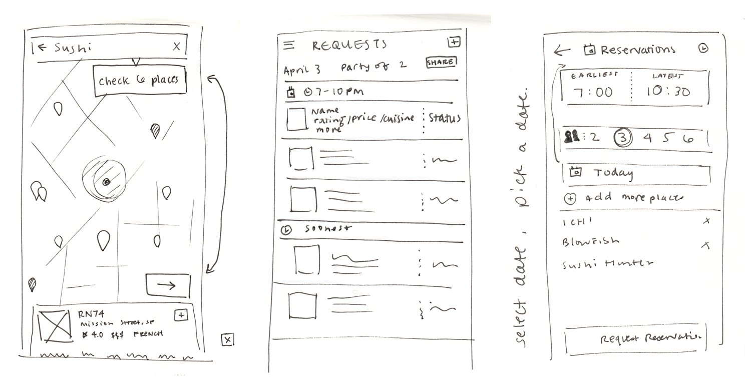
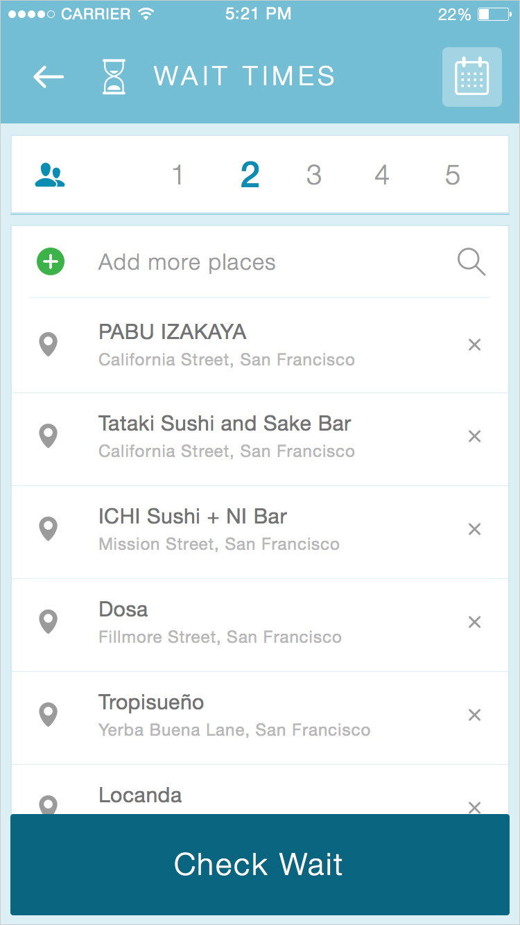
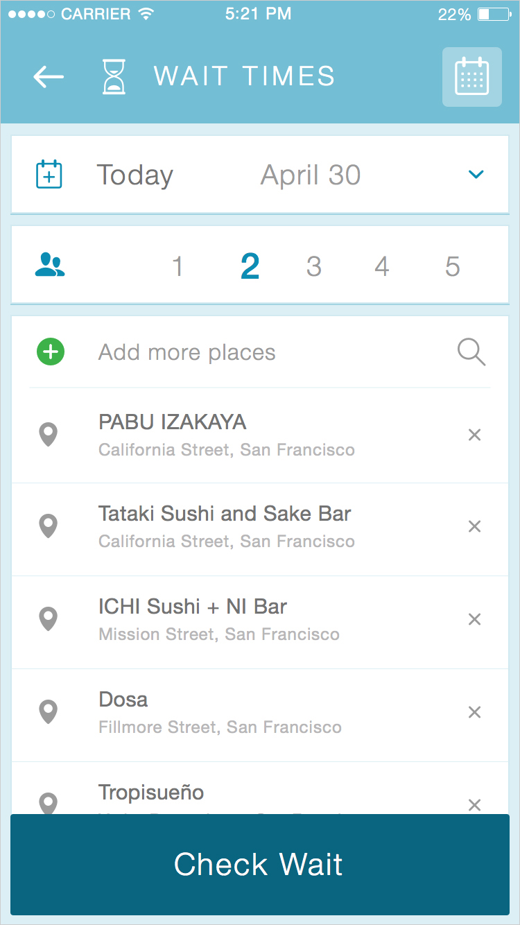
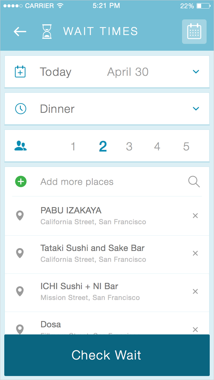
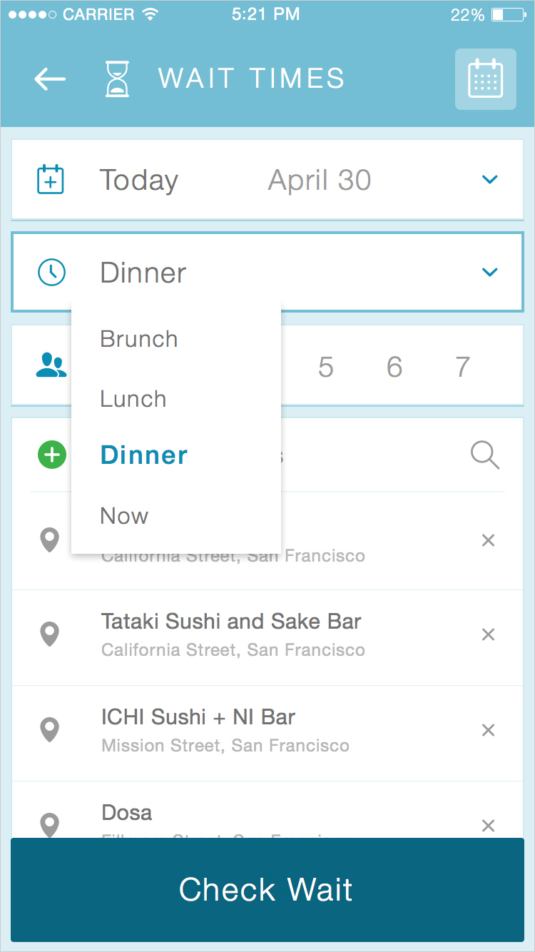
One example of the product that went through several iterations is Wait Times. As a team, we discussed several possibilities for this. Initially, wait times began with the simplest parameters: party size only, defaulting to the day you made the request. Later we decided, what if I know I want to go out to eat on Friday, but it’s only Tuesday, can I batch a future request for a wait time and have it sit there until it’s time for the agent to place the request? So we implemented date and party size as parameters.
But then what if you made the request date a Saturday, and the restaurant is open for more than one meal. Does the agent call in the morning for brunch or at dinner time? So we implemented meal times. Ultimately for v1, keeping it simplest made the most sense, but I’d have loved the opportunity to test all of these and see which performed best. As a web-wrapped prototype, we had to make some decisions to get it out the door as quickly as possible, which also meant compromising some native behavior.
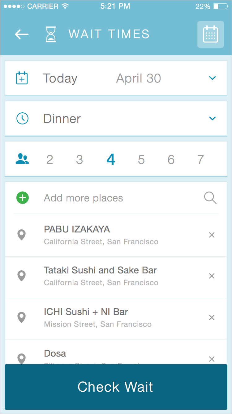
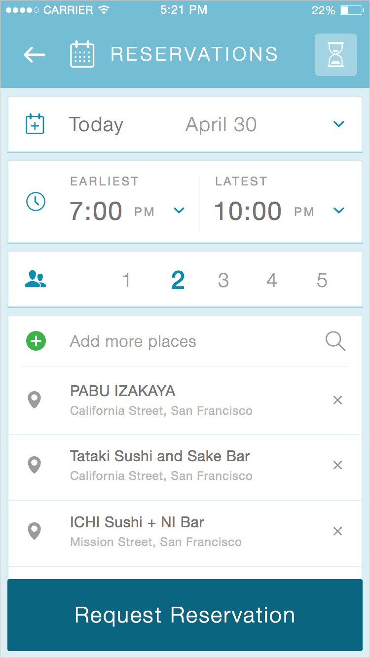
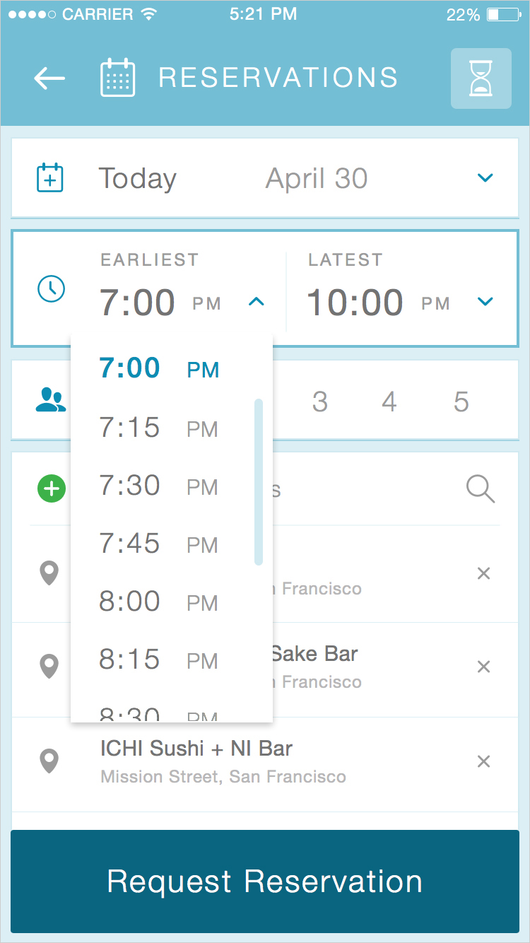
When you press “check 6 places” (or however many) after collecting your restaurants, you’re dropped into the parameters page. You can toggle between wait times and reservations, set your parameters, and cast the batch. This was a lot of information to organize, especially making sure the user is able to clearly focus on the most important thing without becoming distracted. I made several other mocks to isolate the various states and help guide the user through to the request page. In a web-wrap, you can’t use native pickers. Most iOS users are familiar with being able to scroll multiple fields at once, but web doesn’t allow simultaneous scrolling. I had several discussions with iOS and Android developers for future versions of the product, post-alpha.
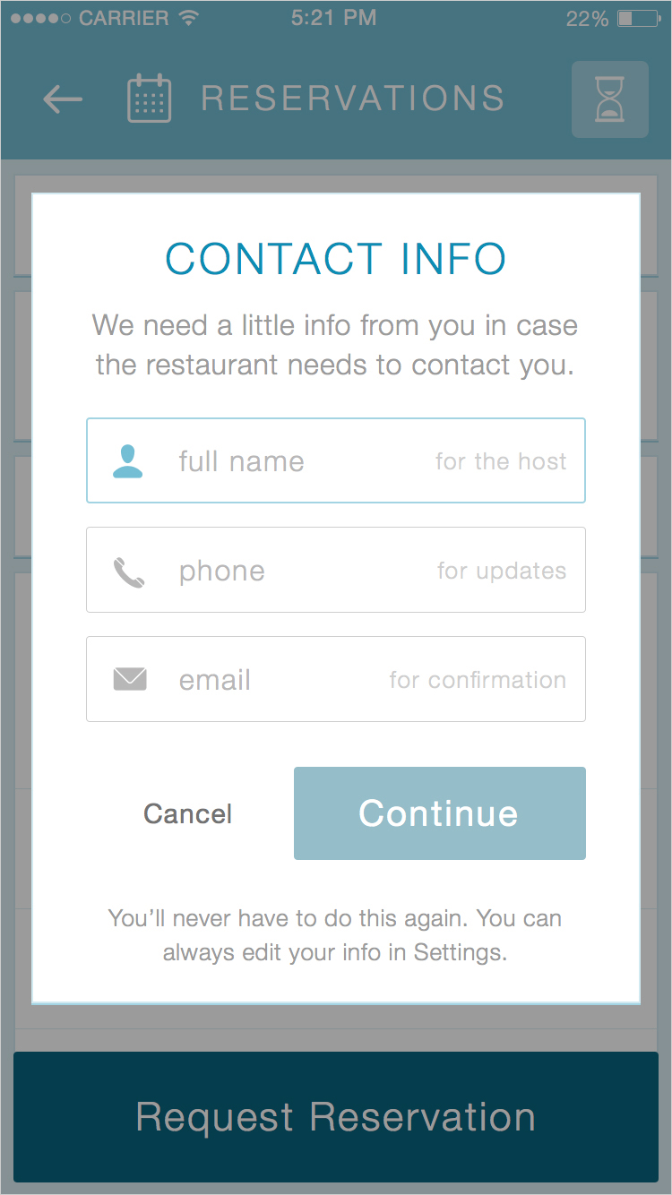
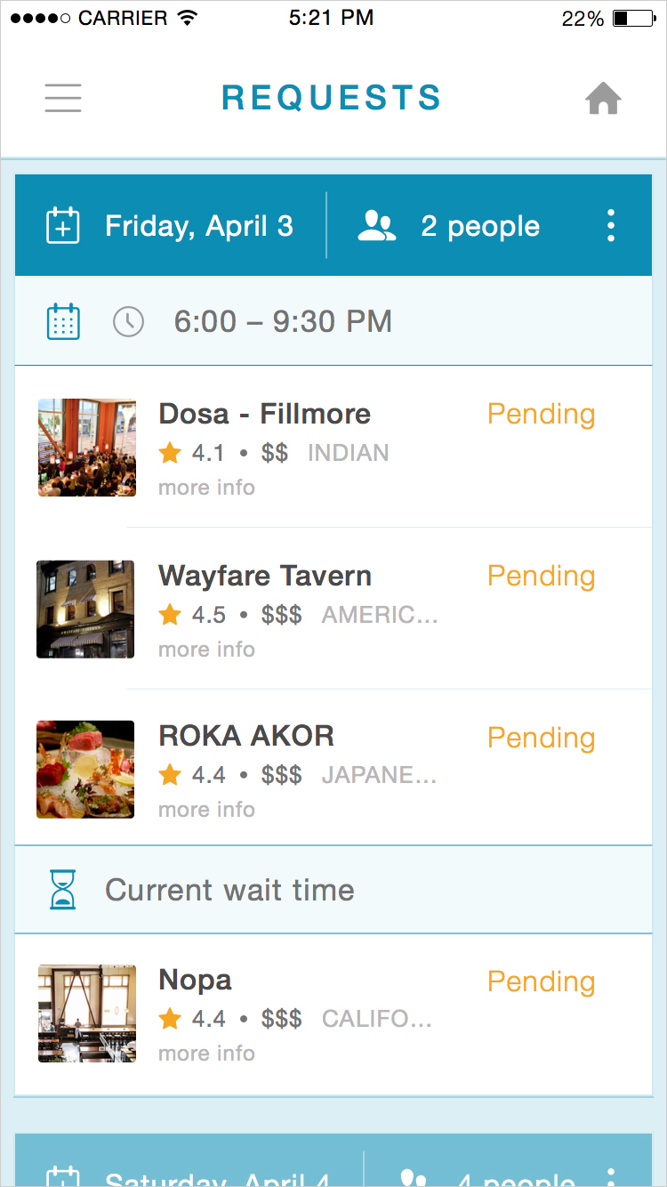
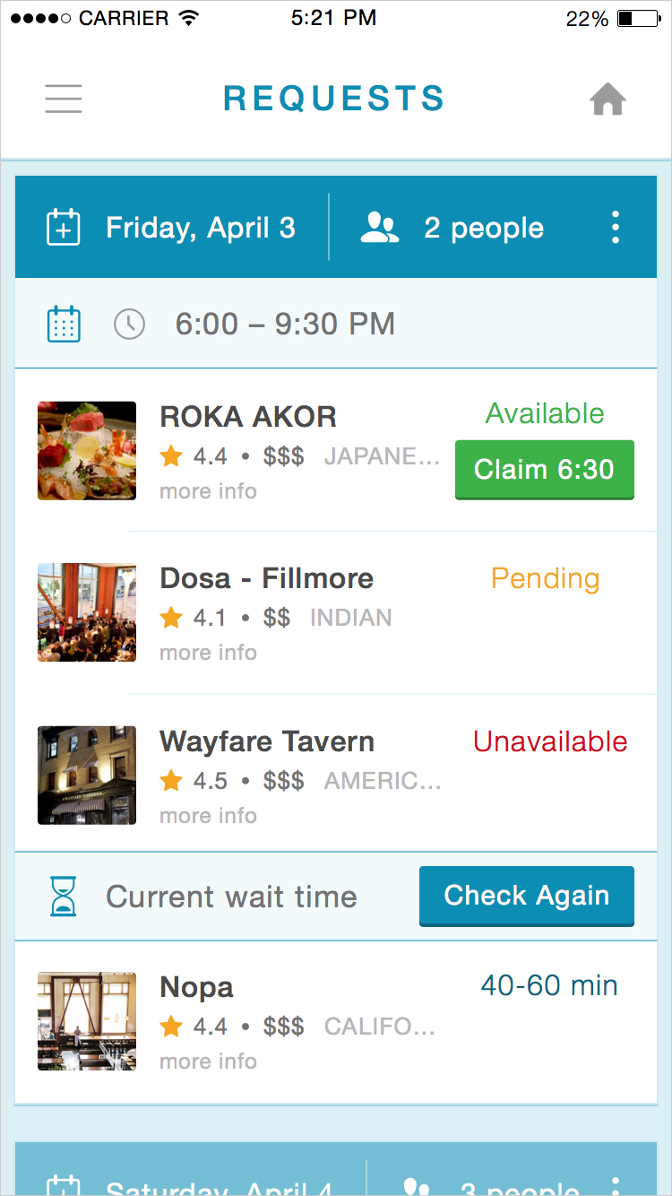
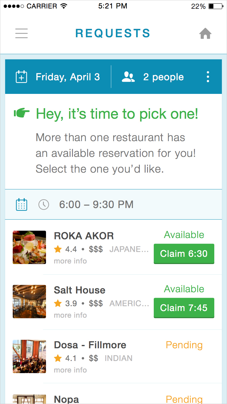
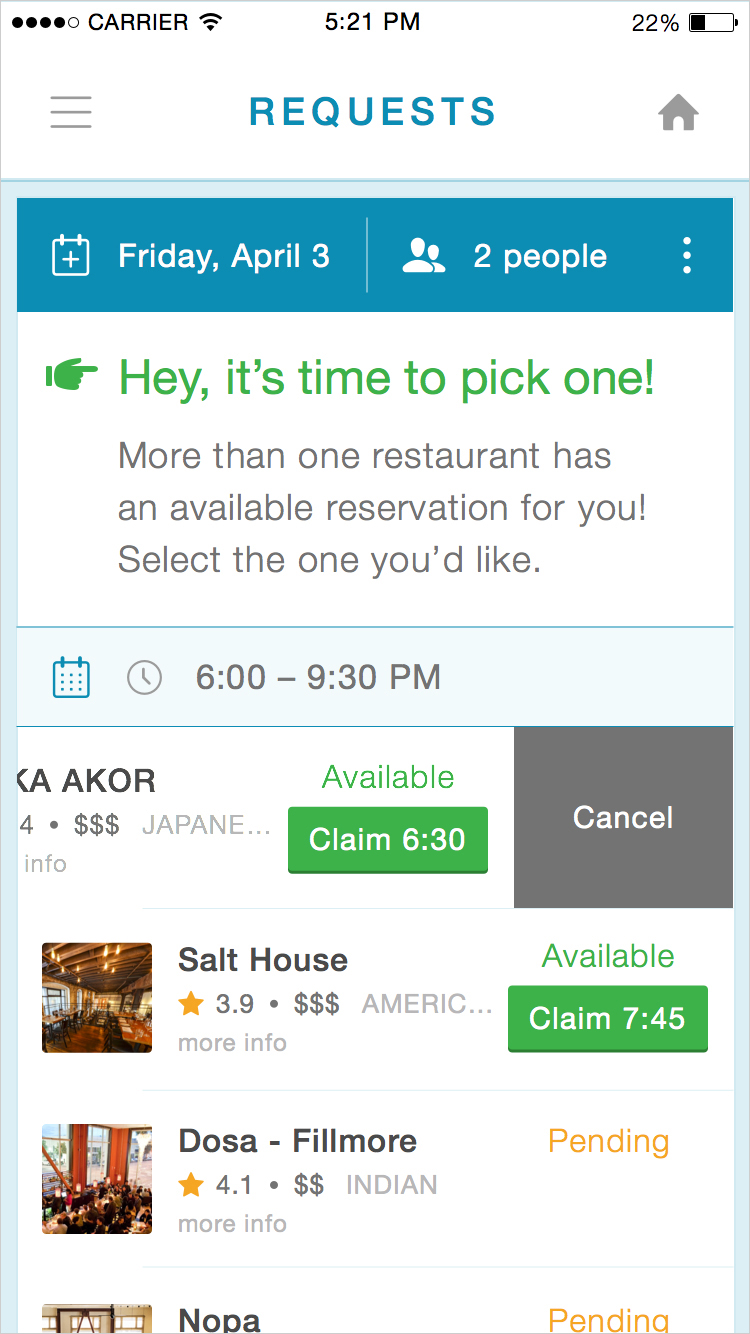
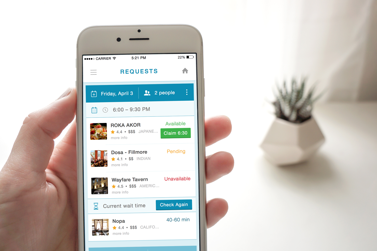
Another recurring conversation was about real-time. If a user placed a request several days in advance, the agent might not be able to reach all of the restaurants within a short period of time. What happens if some are still pending, some are unavailable, and some are already coming back as positive? We had to educate the user to make a decision quickly, even if some were still outstanding. This is a real restaurant on the other end so we needed to be considerate of their needs. Once two or more came back within a conflicting time block, the user needed to make a decision.
I made several extra-long mocks to articulate each various possibility for a request. I assigned a density to each result, so positives floated higher in the list and negatives sank further down, with pending remaining neutral.
Because of the acquisition, we weren’t able to see this through all the way to production. There are still many outstanding things I would have loved to resolve. This as an interesting case study into what can be accomplished despite remote-teams and the constraint of complete open-endedness. It may sound counterintuitive, but having blue sky is often quite a challenge when it comes to honing in on one successful product.
My main goal for future iterations would have been to push the subtle nuance of native interaction to help guide the user, and to simplify certain parts of the flow to encourage a wider audience beyond restaurant power user to feel comfortable browsing. There are a few subtle differences native interaction in iOS and Android would have made in communicating to the user on a different level. I’m grateful for the opportunity to have been at the forefront of discovery, given room to explore the best ways to utilize the human cloud, and I look forward to future opportunities to dive so deeply into product development.
