PadMapper Rebrand Project
At the beginning of 2016, Zumper acquired another apartment rental startup called PadMapper. They are in a similar space, a competitive product with a slightly different demographic, capturing a different part of our market, and coming with a recognizable brand name that people have trusted for nearly a decade.
With only a few short weeks before our public announcement of the acquisition, our CEO, Anth, asked me to redesign the PadMapper logo and do a “warmover” of the PadMapper brand.
The goal: Create a clear, recognizable identity, while maintaining the essence of the brand.
Words that came to mind for him were friendly, approachable, trustworthy, real. PadMapper is no fuss, what you see is what you get, no scams, no obscurity, no broker nonsense, just real, honest, pure, easy, simple, gritty.
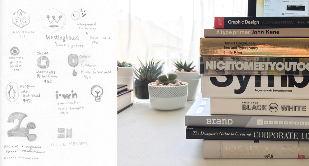
The whole redesign, encompassing brand, product, and identity, took place over the course of about 3 weeks (five if you include eng time). It’s one of the fastest complete turnarounds I’ve done in my professional career. I started by returning to my roots, and pulled out my pile of books on branding and identity from college, quickly jotting down some of the more iconic positive/negative space marks.
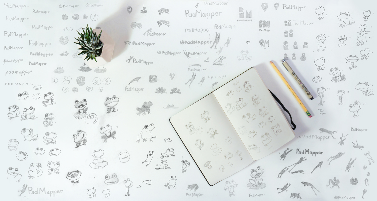
One of the philosophies of working practice that I’ve carried with me since college is overproduce, edit later. You can always edit out bad ideas, but only if you’ve come up with enough ideas in the first place. As I began sketching, a few things became immediately clear as pieces to keep or exclude as we progressed. The pin, a very recognizable part of the PadMapper product, proved to be too limiting moving forward. If we decided to include it in the logo, we’d be hard pressed to change the product in the long term. As we would be merging Zumper’s codebase with PadMapper, and the clustering of pin data is treated differently on each site, we didn’t want to pigeonhole the product functionality into the logo. So, for a more open-ended and friendly approach, we focused on the frog, a previously background character to give personality to the lilypad.
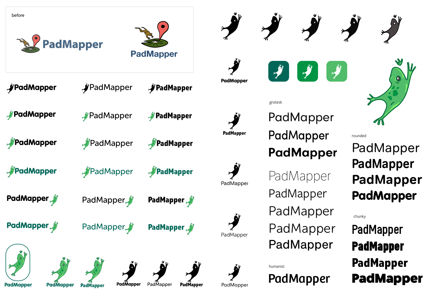
As with every project I’ve ever worked on, there comes a time, sometimes early, sometimes quite far in, where I have a realization that the direction I’m headed, however brilliant or great, is inappropriate for the scope of the project. I’d been headed intently down the path of elegant, leaping frog silhouette, reminiscent of a book publisher’s logo. I very quickly picked up on two problems.
1. the details became lost at a small scale, and
2. the mood was not right for the brand.
It was headed in a sophisticated and cold direction and had lost the personality we were trying to maintain.
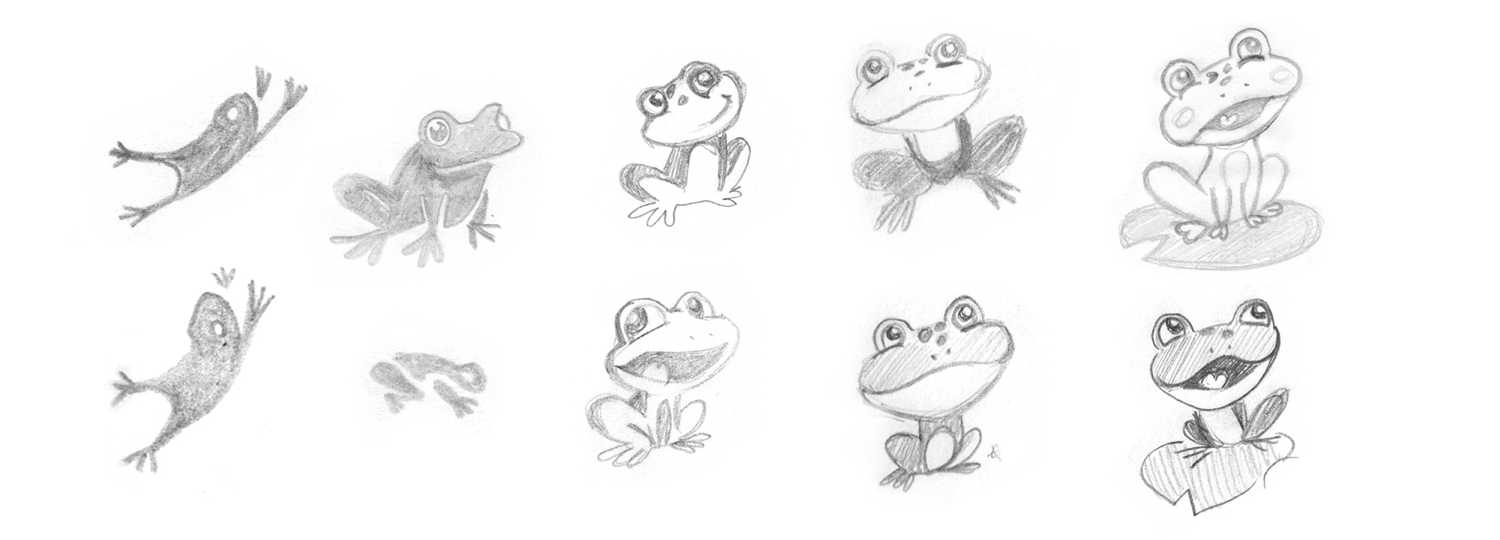
Anth agreed and asked me to step back to the beginning. Try a mascot! I didn’t want it to be too cute, I wasn't sure. But, always one to try everything and decide later, I went back to my paper sketch book and spent a day and a half drawing “cute” frogs, in sitting, jumping, profile, front, cartoon, stylized, anatomically accurate, everything. Anth’s hunch about the mood of the brand proved to be right. We highlighted a few and moved into higher fidelity.
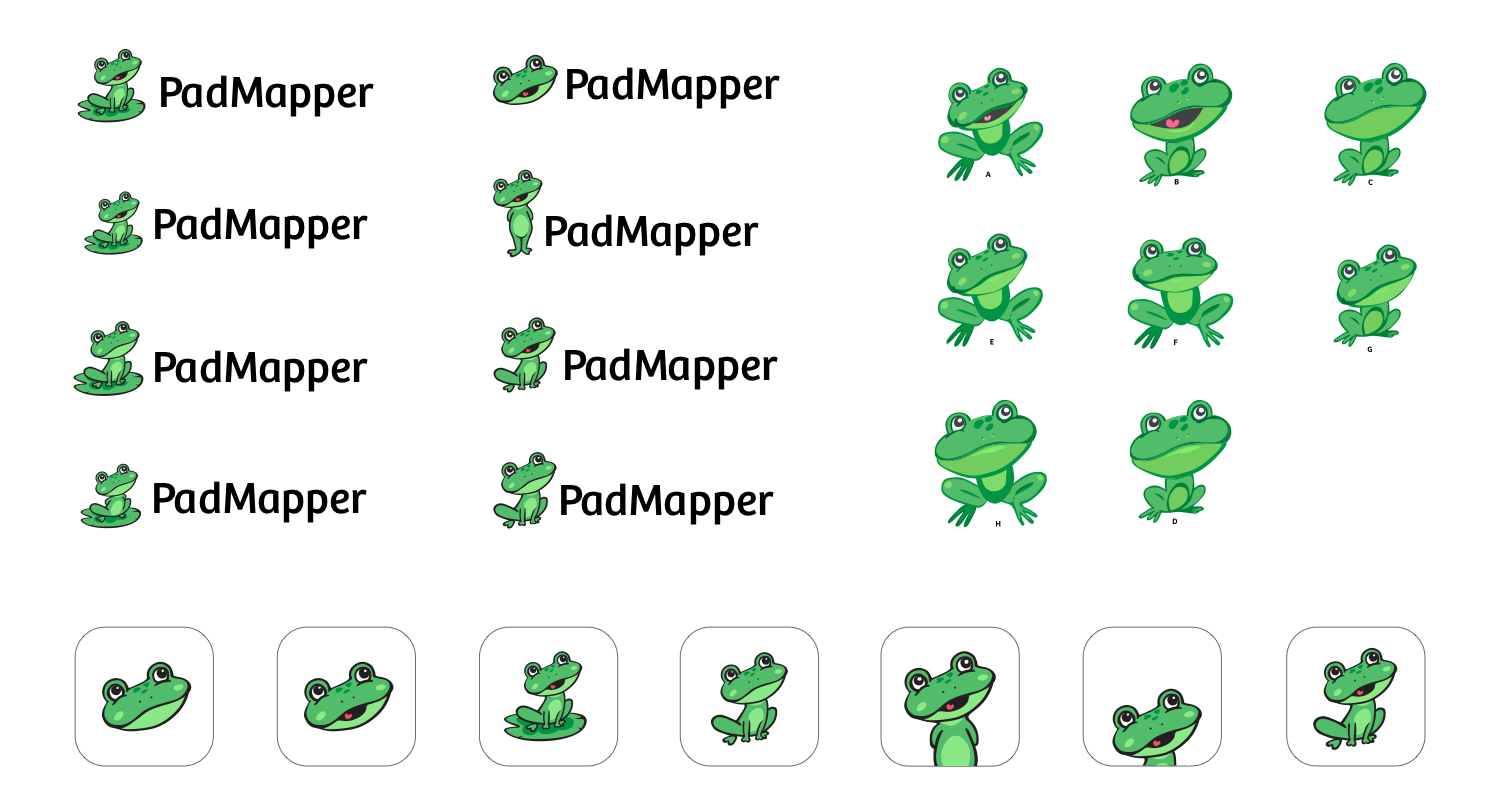
He’s your friendly helper, guiding you to find a new place. He’s your buddy. He's just as excited as you are to find that perfect new apartment! This is easy, not stressful. I tried a number of subtle changes which amounted to several hundred different versions with near-imperceptible differences. Does it have arms? head tilted this way? that way? mouth open or closed? outlined in black or full color? Even down to changing the size of the pin-prick eye shines so that they still read at a small scale. The main goal at this stage was to subtly achieve the right attitude. The frog needed to be at ease, natural, comfortable, and remind you the process of finding an apartment isn’t so grueling when you use PadMapper.
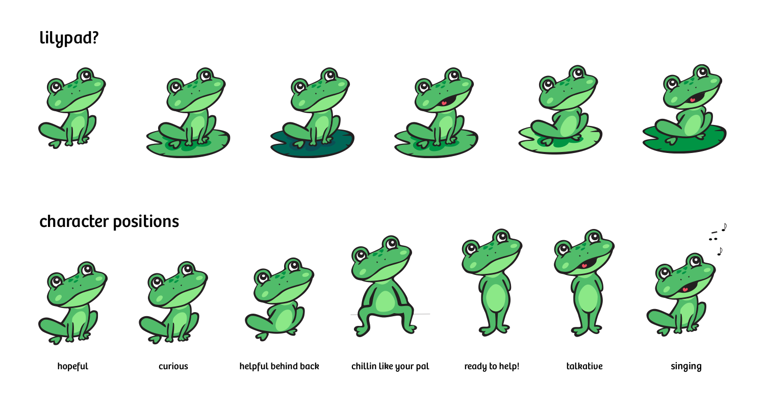
We oscillated on the inclusion of the lilypad in later versions. It brought a grounded element and a presence to the logo as a whole, but was also not very readable at a small scale. Going forward in the product overhaul blue-sky product, we’d have much more flexibility, but for the launch in less than 2 weeks, we needed to make sure the logo read well inside the existing 60px high navigation bar at the top of the website. Lots of decisions are made easily when the scope is limited to a product launch in 2 weeks.
One of my favorite ideas we entertained is pushing our new mascot into the realm of character. Having him take various positions depending on what you’re trying to accomplish. PadMapper hasn’t done much branding or email, doesn’t have a landing page, the product is the product. If we decided to expand it in some way in the future, having a manipulable character with variable positions could be a valuable asset, though difficult to implement if not done properly. We’ve tabled this for now, but peek back in the future, maybe it’ll come into play someday.
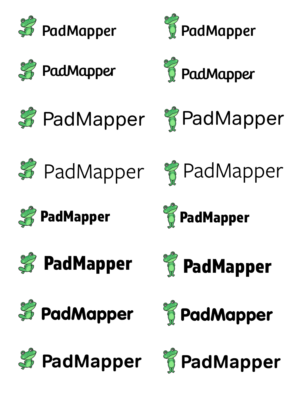
The last bit was really refinement. Earlier in the process, I’d picked several typefaces, varying from geometric rounded sans to a more humanist sans. Ultimately we decided Bree fit the tone best; designed by Veronika Burian and José Scaglione at TypeTogether. We felt the qualities of the typeface represented the essence of the brand. Approachable, soft, human, quirky, simple, and clean. In their own words, “Bree shows a pleasant mix of rather unobtrusive capitals with more vivid lowercase letters, giving text a lively appearance.”
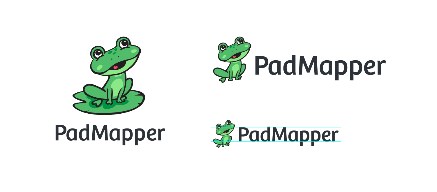
Projects like this make me really happy. As a small team, moving very quickly, we were able to iterate and launch something great in a very short space of time. It’s a mark of how well we work together that we’re able to keep this pace and still produce at a high quality, and I’m proud to be a part of it. Want to learn about the product redesign?
 Read about the PadMapper product redesign