PadMapper Redesign
In January of 2016, Zumper acquired PadMapper, making us the largest startup in our space and joining our teams in progressing our shared mission of alleviating the experience of apartment hunting.
Historically, the two platforms have taken a bit of a different approach to apartment hunting. Zumper is a robust product, packed with powerful tools, an advanced set of filters, and guides about each city. PadMapper, on the other hand, provides a softer, more hands-off solution. Our challenge was to redesign PadMapper to feel at home alongside Zumper, while retaining its integrity and identity and highlighting the different needs of the people who rely on it. This provided us with a blank slate to experiment with some larger changes as well.
The Challenge
As the sole designer at Zumper, I took on the challenge of redesigning the product with a small team of engineers. My goals were to simplify the experience, modernize and unify the products, and keep the core integrity of what users expect out of PadMapper. People who use PadMapper love it, are loyal, and have used it to find multiple apartments over the years. They’re used to searching and browsing on their own in a safe, trustworthy platform with no fuss and no extras. We wanted to respect that, first and foremost, while also bringing it up to speed with a fully functional mobile experience.
However, there was more to it than just a lick of paint. In addition to rethinking the product experience, it was important to us to bring PadMapper’s tech stack up to date and merge the backend content with Zumper’s for easier management, making their product run more smoothly.
Before any of this could happen, we completed a three-week sprint to rework the branding and design a new PadMapper logo in time for our acquisition announcement. In early March we assembled a small team – made up of the CEO, Anthemos, the Product Lead & head of Front End, Nico, the Head of Padmapper, Russ, and myself as the product designer – to really get the ball rolling and identify our key goals and objectives.
We wanted these goals to be broad enough that we could apply learnings from this project to future tasks with our wider set of core products. We landed on these:
- Generally, make apartment hunting less miserable. Continue to simplify a process that is usually grueling and unpleasant.
- Have the interface align with the brand: trustworthy, supportive and honest. (read more about that here!)
- Address consistency across all products (unify desktop, mobile web, android, iOS to feel like one brand)
- Increase conversion (When a user is searching, if they message a listing and then move in, that’s awesome!)Update the tech stack
- Update the tech stack
The Process
Huddled in a conference room, Anth, Russ, Nico and I worked very quickly to make a lot of early decisions on paper before moving directly into high fidelity. This way, we could quickly flesh out ideas without wasting valuable time. It soon became apparent there were a few key items to dive deeper on:
- Hybrid map and list view to replace the older popover-style interface
- Card views to display data consistently and responsively throughout the experience
- Visual language refresh to unify and modernize all parts of PadMapperA fresh take on a simplified yet powerful filtering interface
- A fresh take on a simplified yet powerful filtering interface
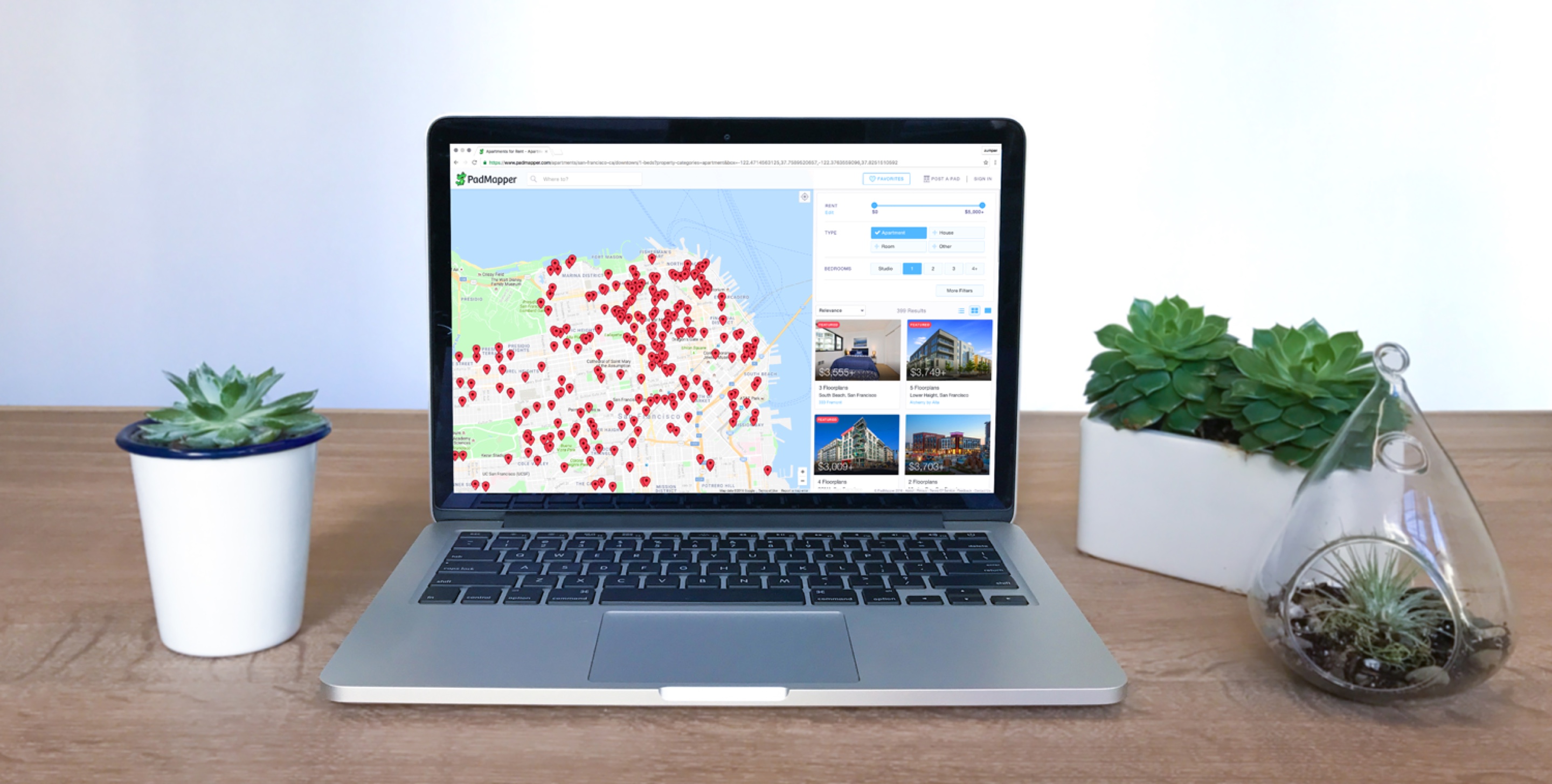
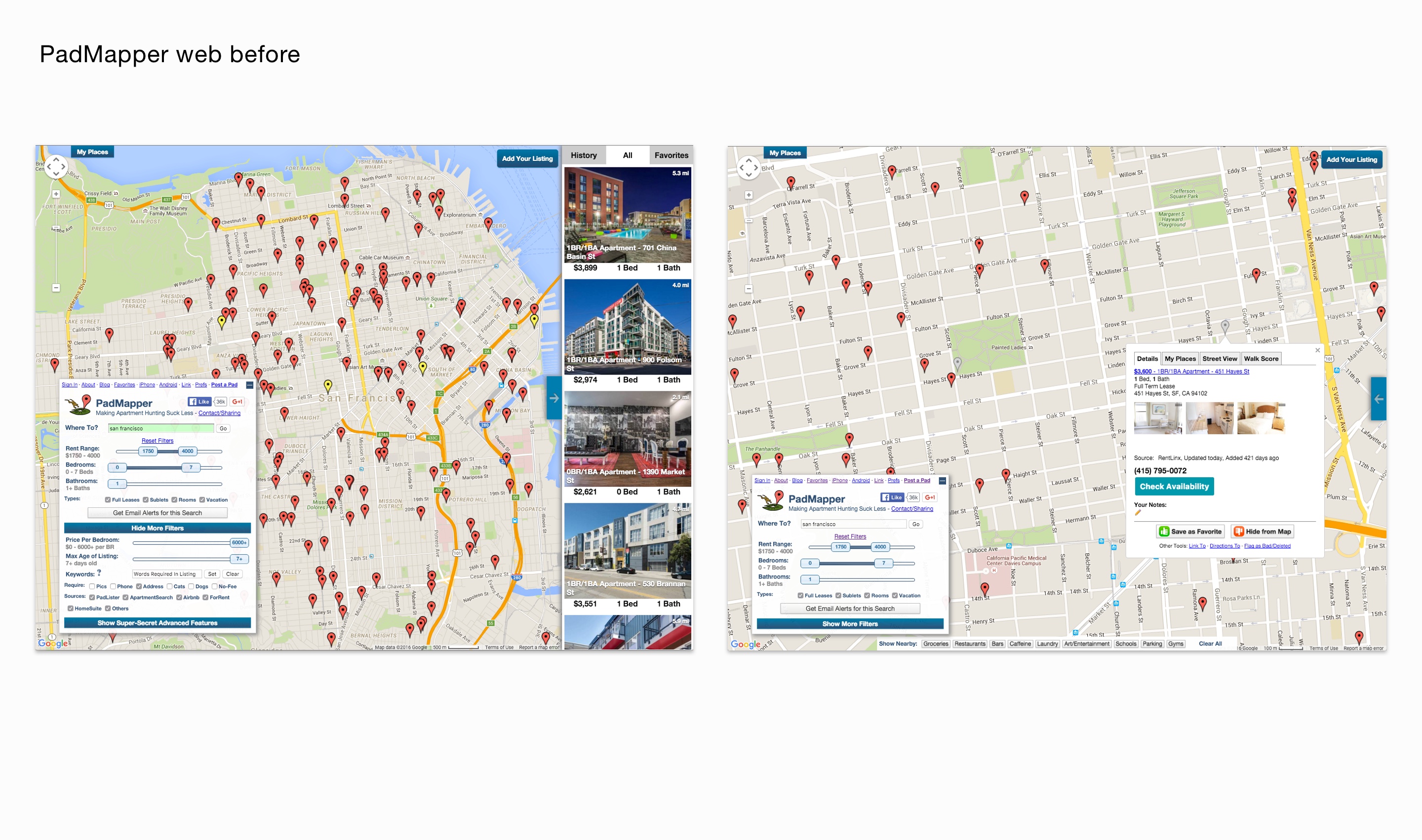
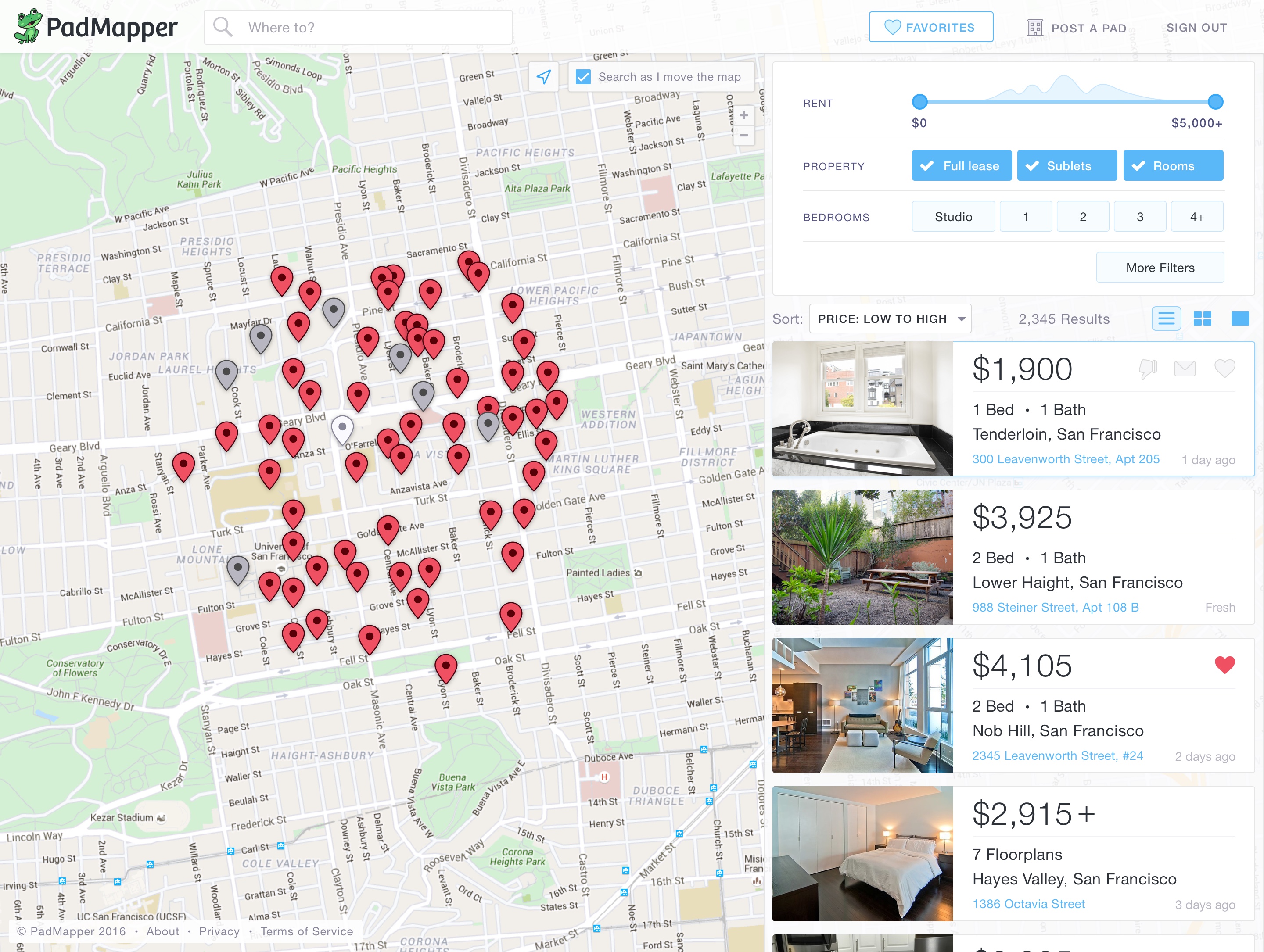
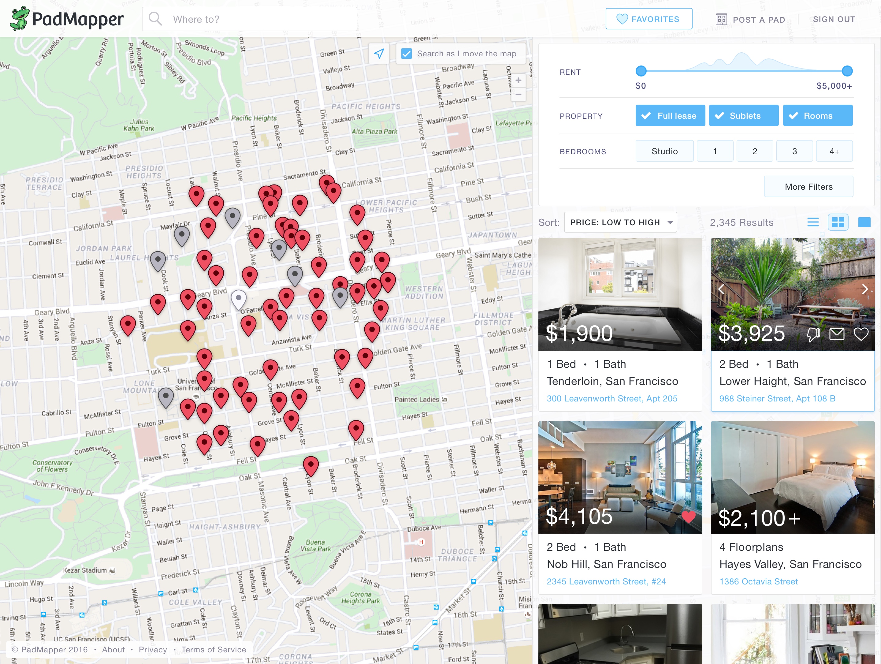
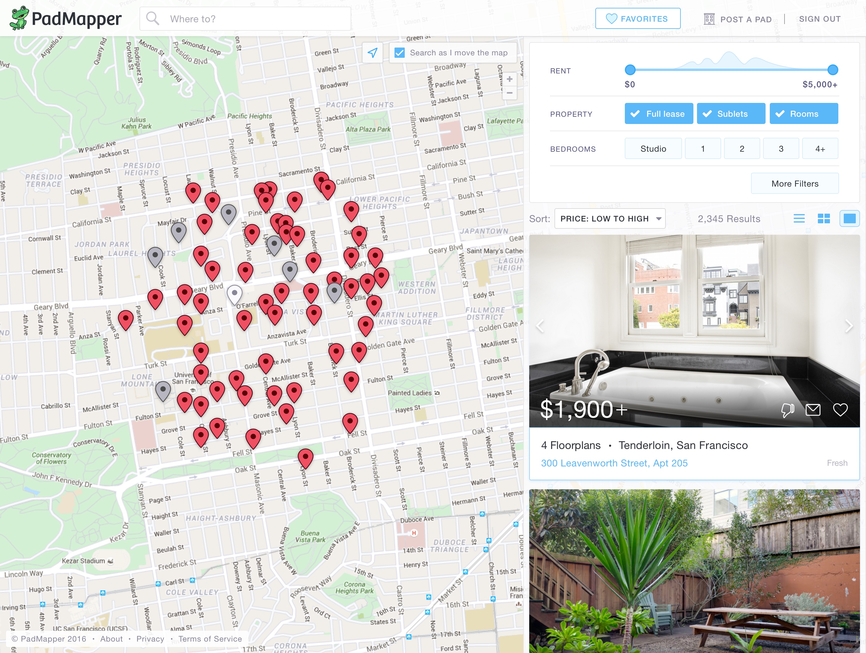
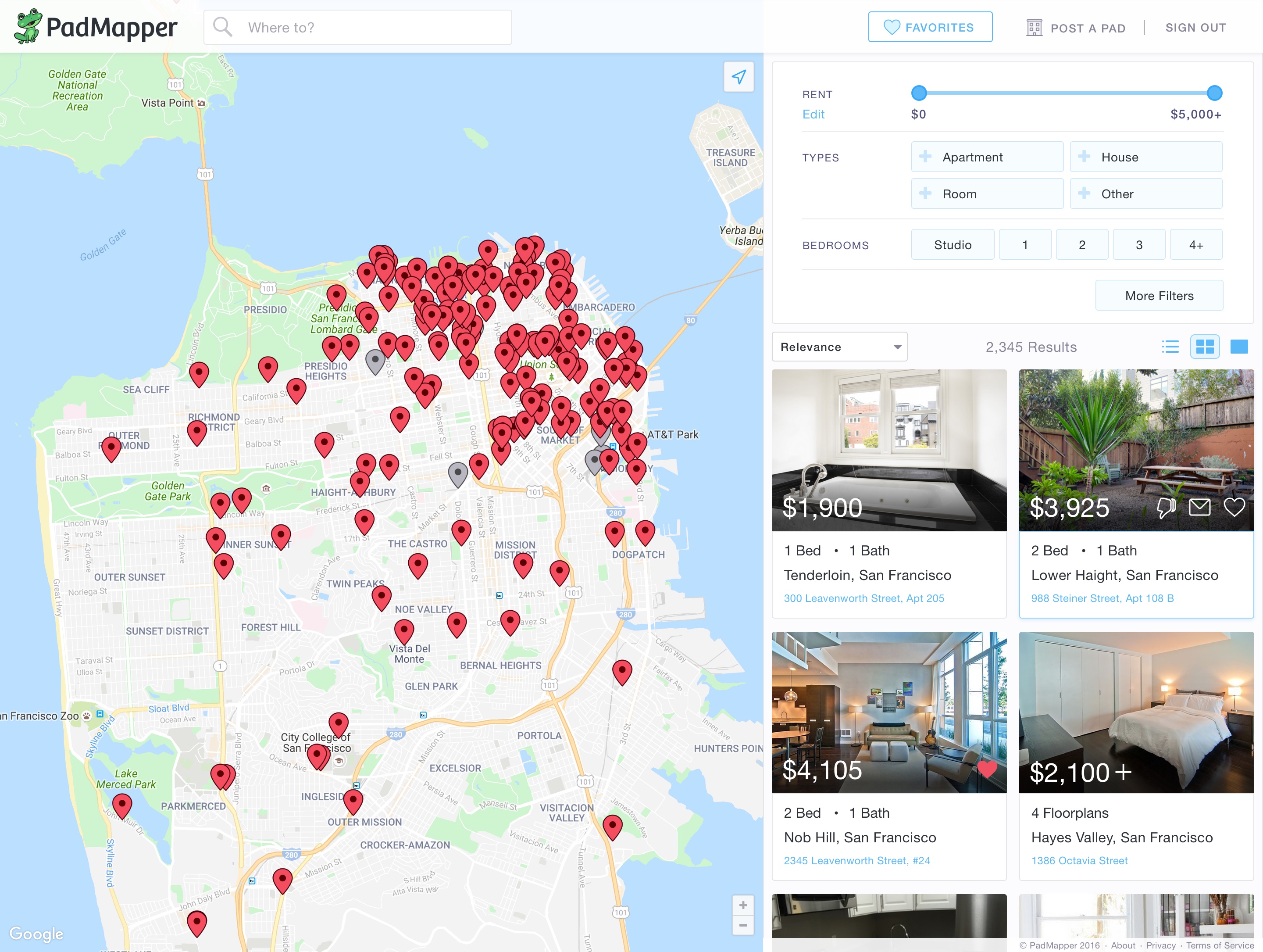
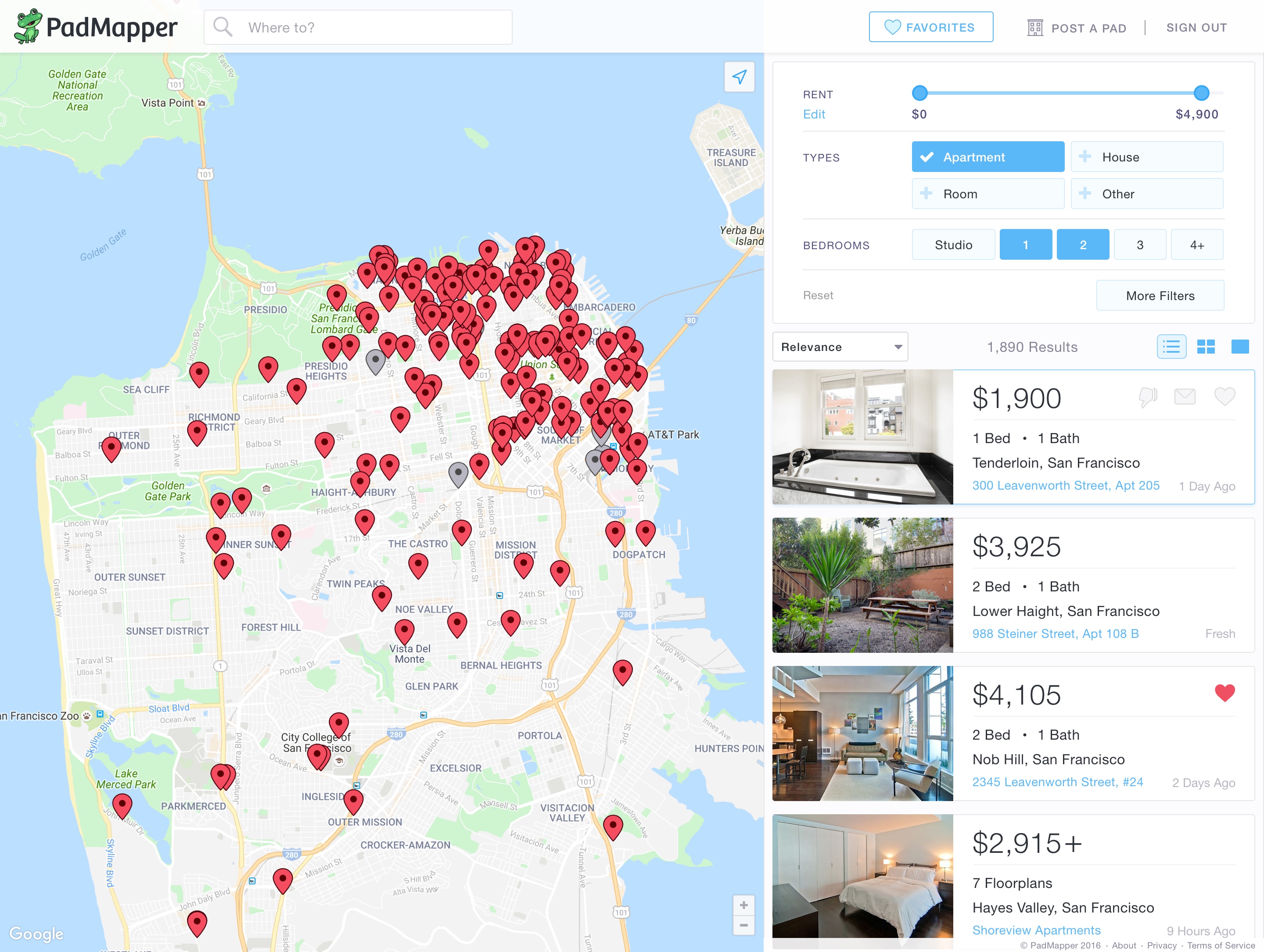
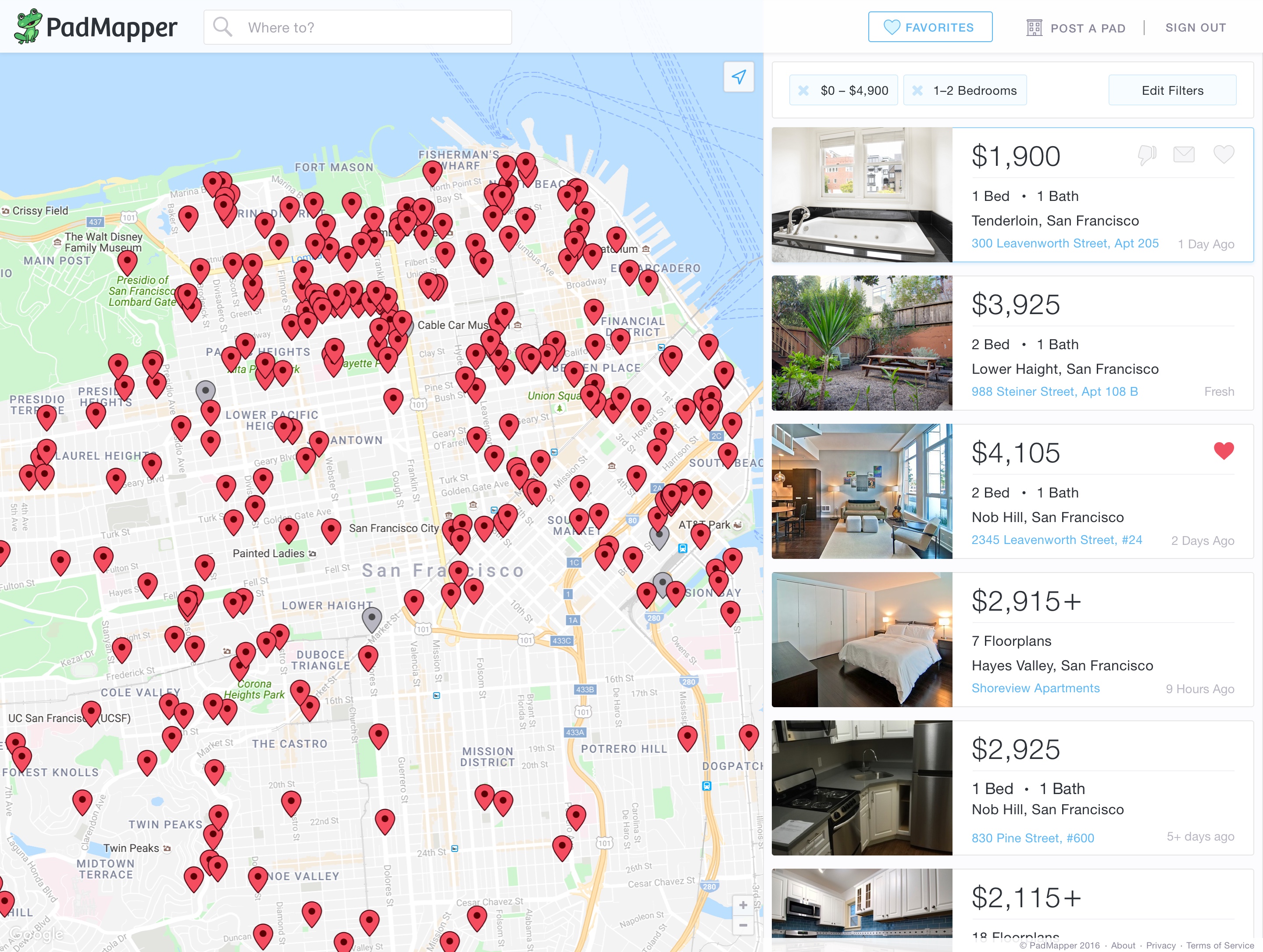
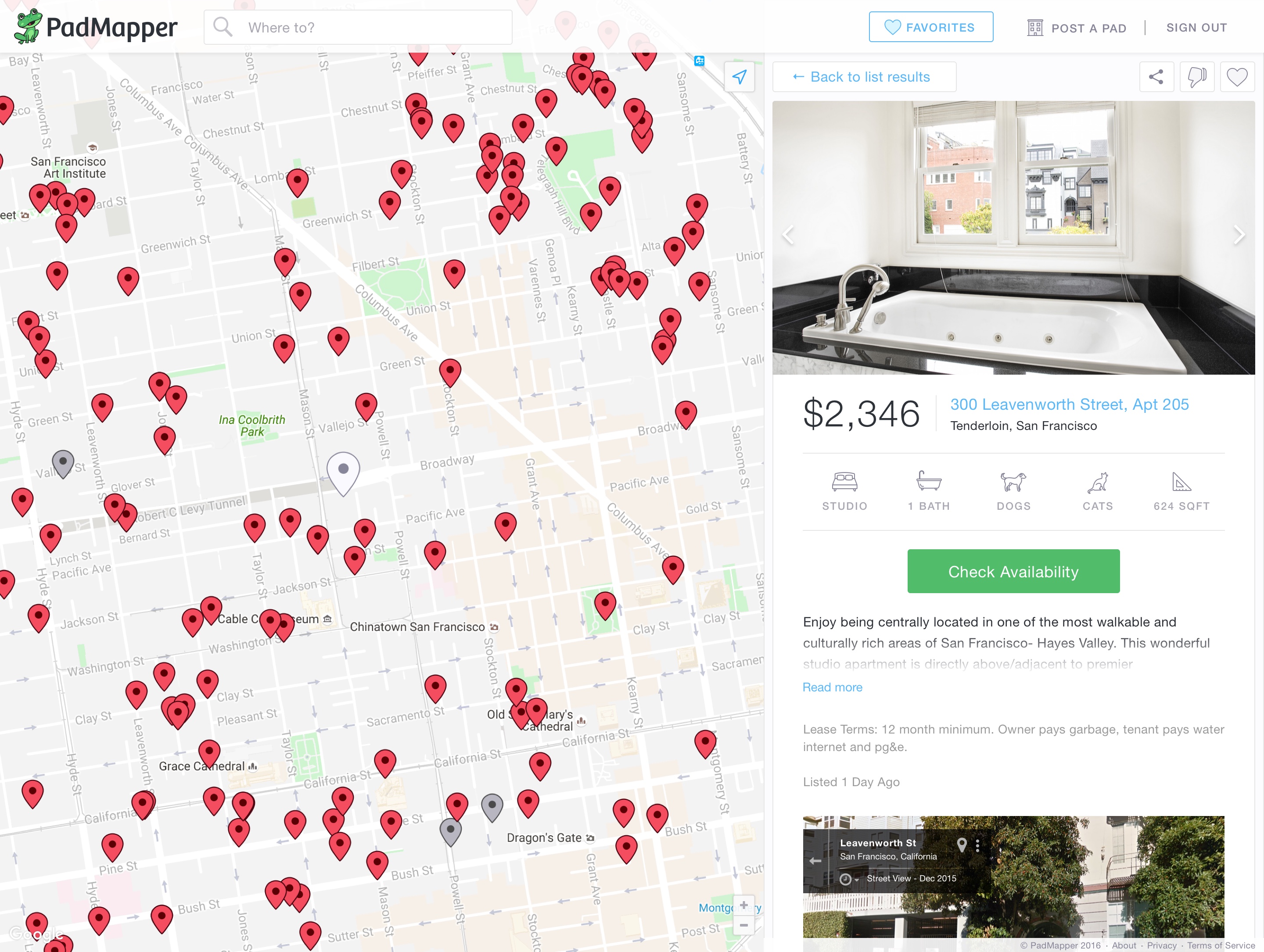
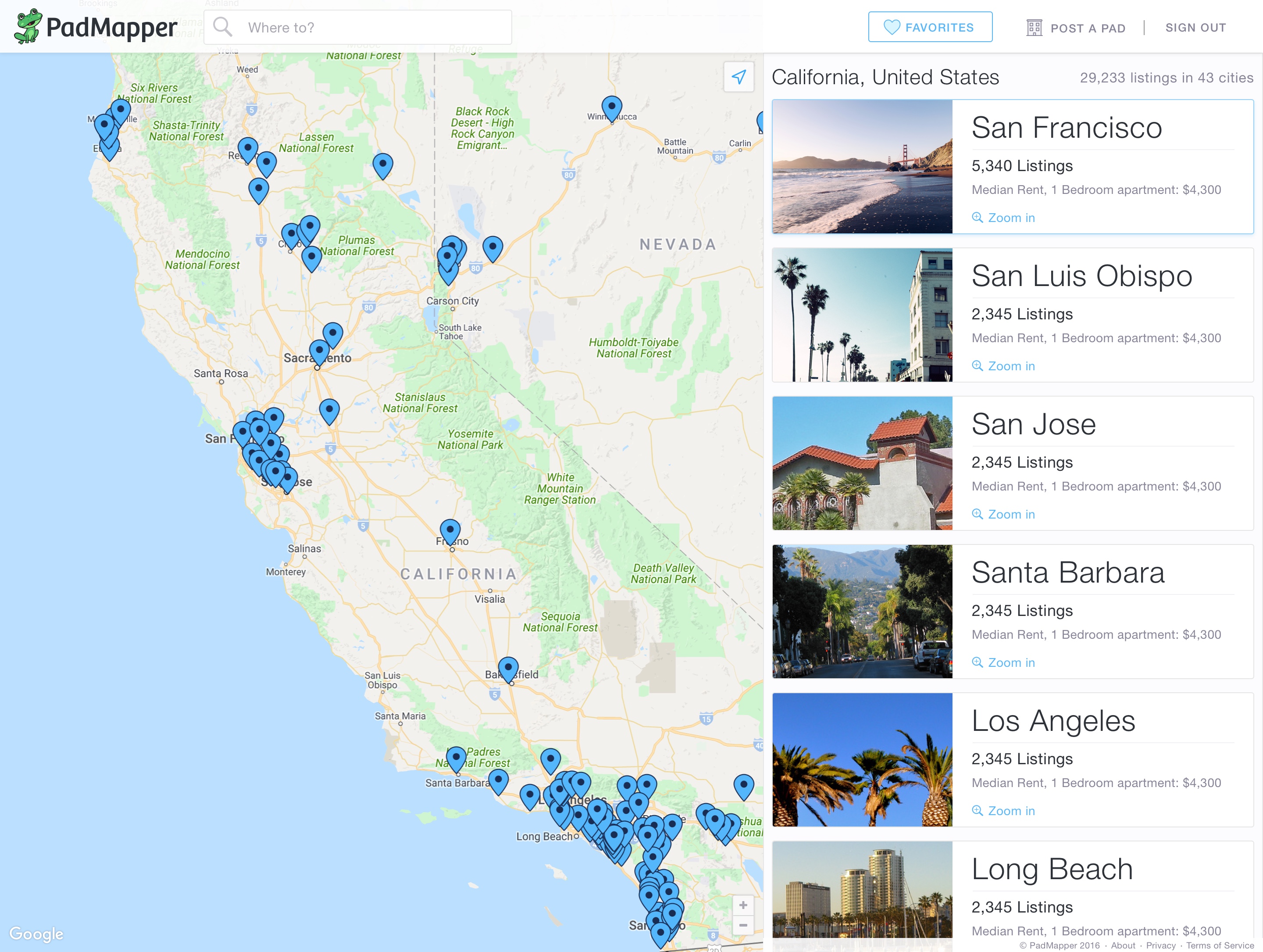
The hybrid map/list layout
We knew we wanted to build a hybrid experience with the map and list in the same plane. The objective here was to minimize interface “traveling,” which in turn reduces unnecessary navigation throughout the site, and allows the user to accomplish his goals more efficiently. The addition of the side panel would add a layer of context that did not exist previously, a significant improvement for surfacing details quickly. This became the structural guide that dictated the way we built the rest of the site. We set some constraints to ship more quickly and decided that our side panel would not be responsive for this first release.
After quite a bit of early research and several whiteboarding sessions, I churned out sketch after sketch until we had a solid concept of what we were looking for.
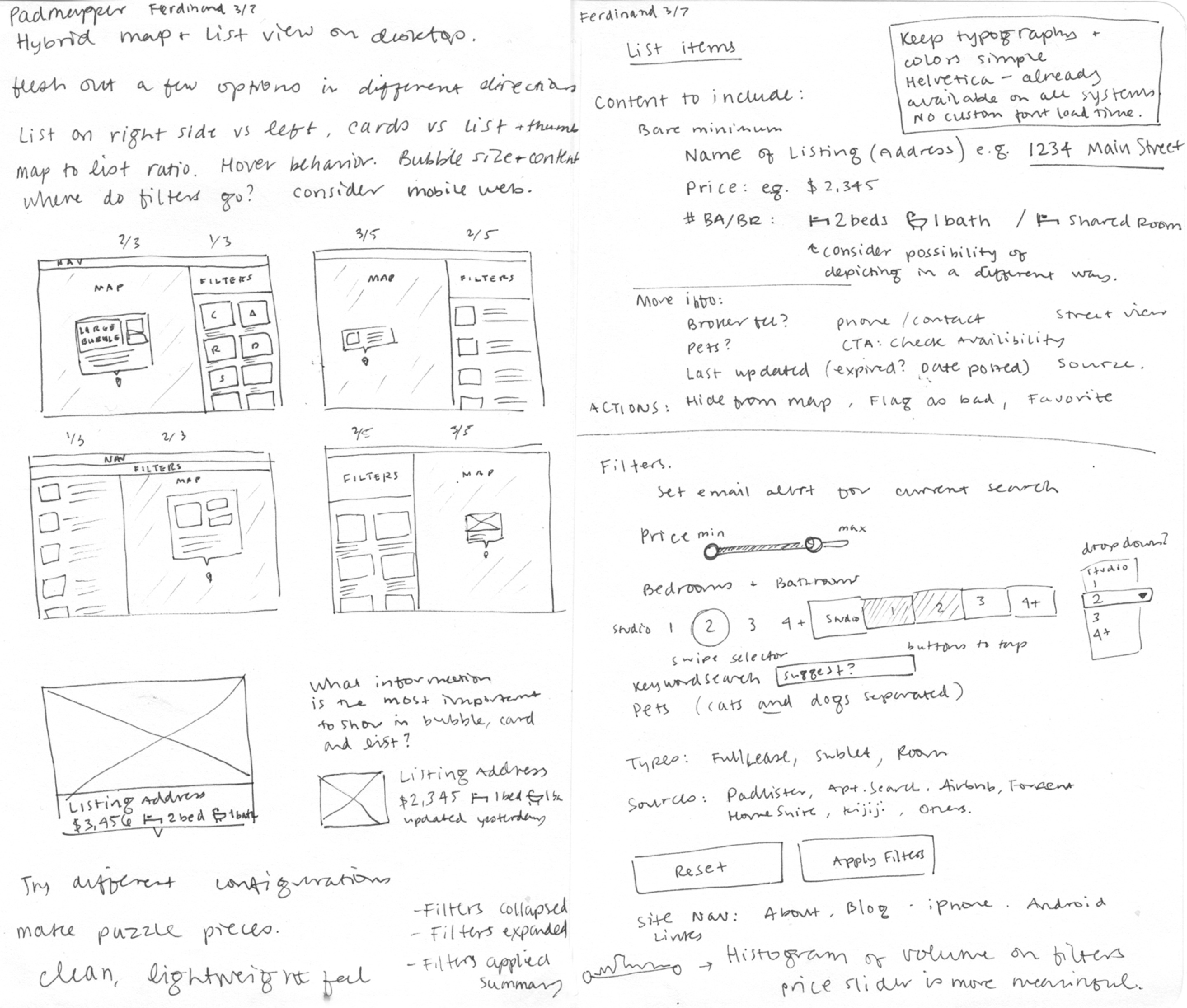
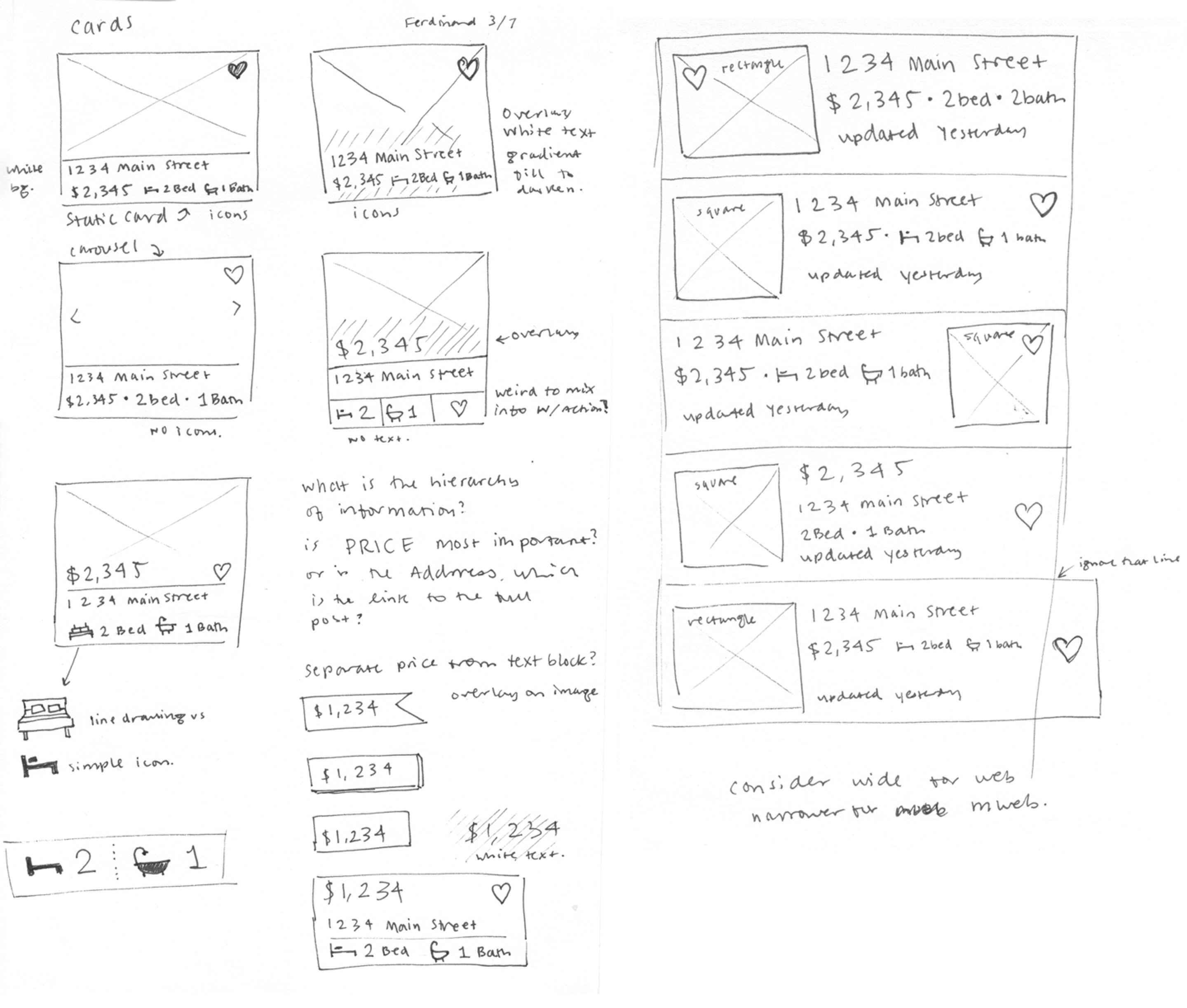
The List
Our self-assigned constraint of the fixed side panel was valuable in exploring different ways to visualize the same content. We identified three core ways in which users might prefer to navigate listings in this map/list hybrid, from dense listings to larger, more visual cards, with a plan to provide a simple way to switch between these views.
A horizontal list view packs in the most information for a get-it-done attitude, allowing for a quick, determined browsing experience without having to open any new tabs.
Side-by-side tiled images give a user a quick general sense about the type of place they’re looking at, removing unnecessary details and allowing her to go more by feel instead of being overwhelmed with information. We have a hunch this one will be most successful but we haven’t finished our experiments yet (secret data stuff shhh).
Lastly, the full width cards really give the user the opportunity to slow down and thumb through nice big images and get a sense for the place, without having to lose the context of the map or go back and forth between pages too many times.
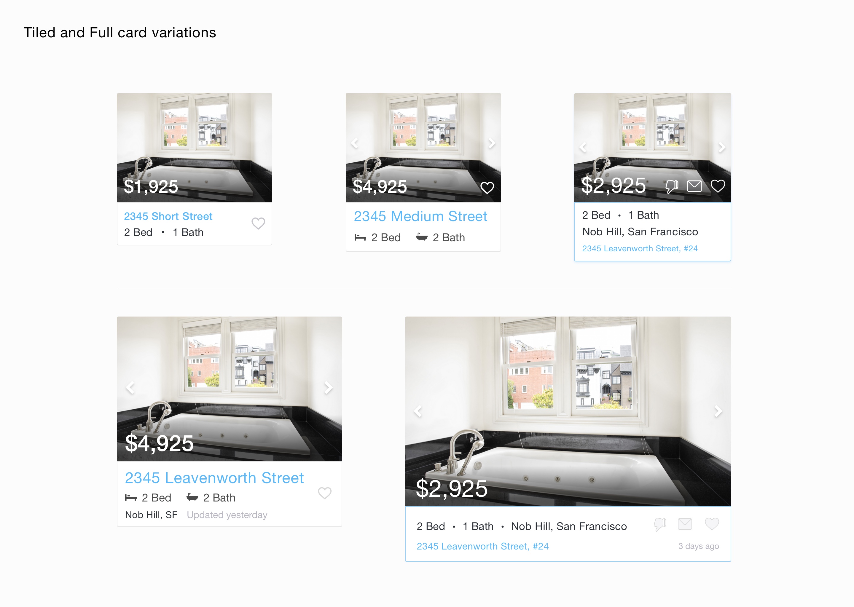
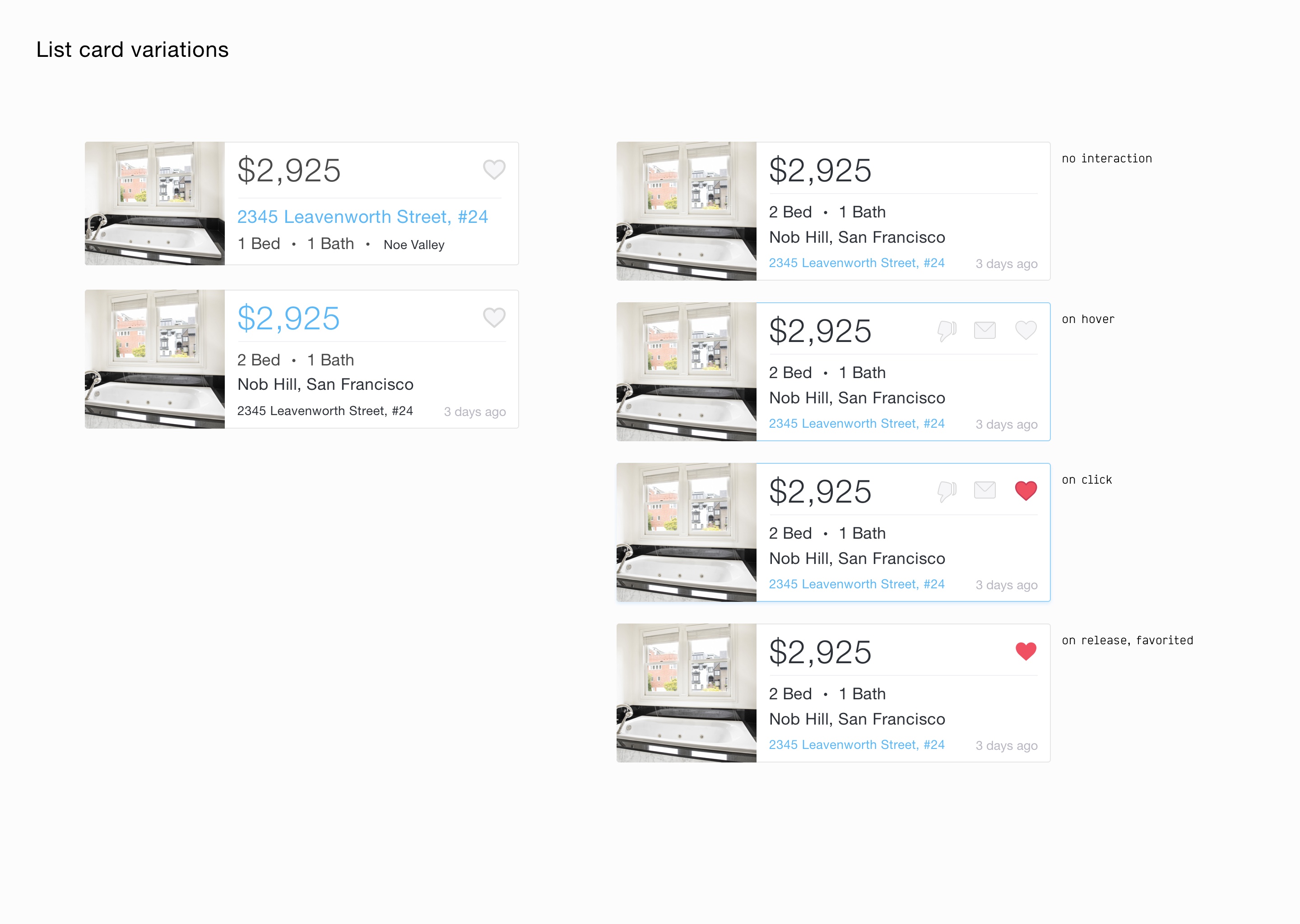
Now began the crucial task of determining the hierarchy of information for each of these different experiences. From our work on Zumper, we already had some insight into what vital listing information was most valuable: address, price, recency, bed/bath/floorplans, neighborhood, and of course, photos. While the biggest focus on Zumper is the address, I felt it was important to demote the address on PadMapper in favor of the price, given the entire interface centers around a map. Highlighting the unit price feels more natural, and is also much more glance-able than a long address.

Visual language refresh
As we fleshed out more pieces of the product, it became necessary to determine a full style and language guide, so I took what we had established early on in the brand redesign and applied it to our web product.
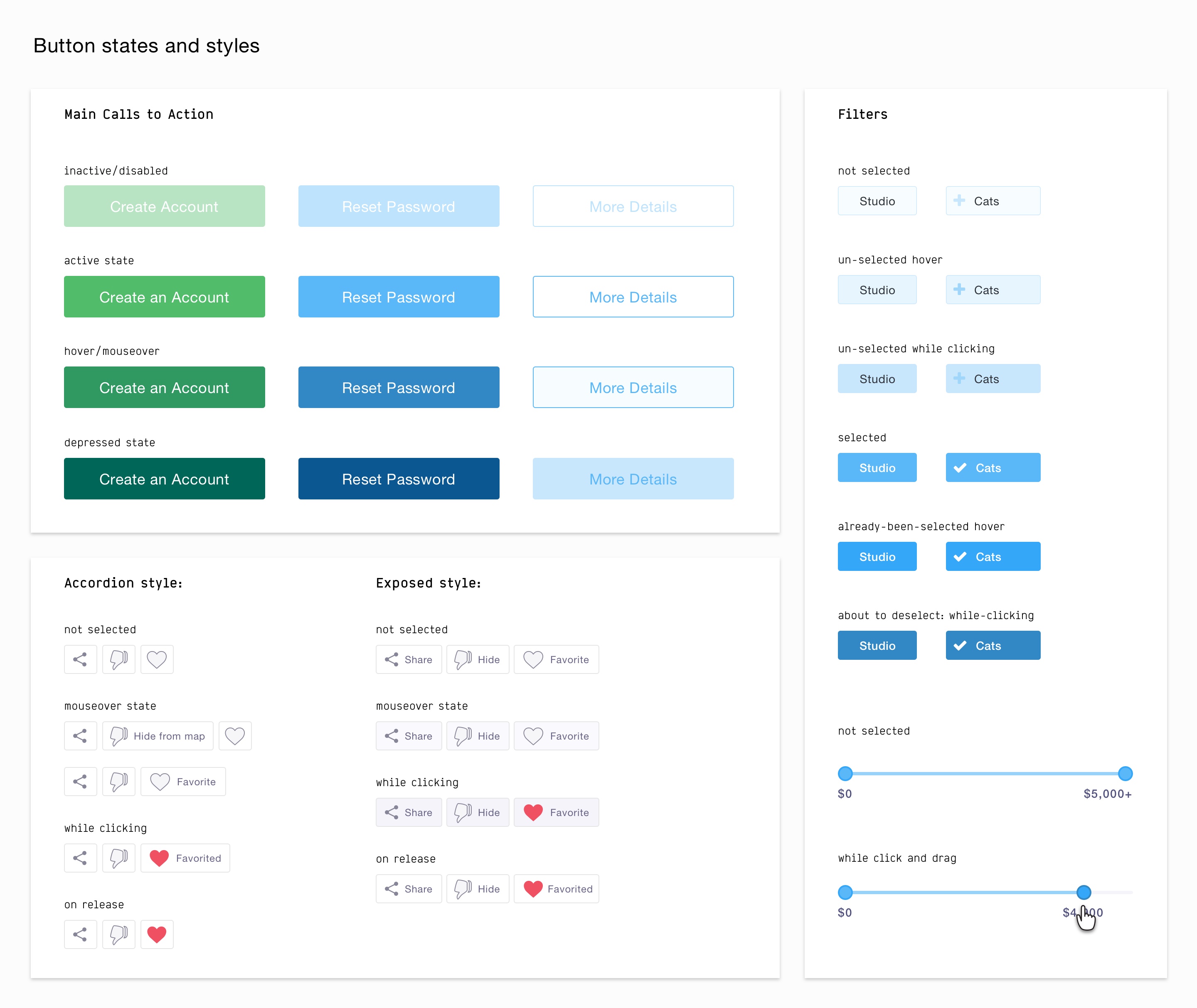
We chose Helvetica Neue to keep the product lightweight instead of serving up a custom webfont. We made some basic color palette selections too: red for the pins and favoriting, blue for confirmation states and completion of tasks and green for calls to action. I also softened the greys using a chromatic palette. It was important to me to keep the recognizable identity PadMapper had before, with red pins at the forefront, while brightening the existing palette for a more youthful, modern, approachable feel.
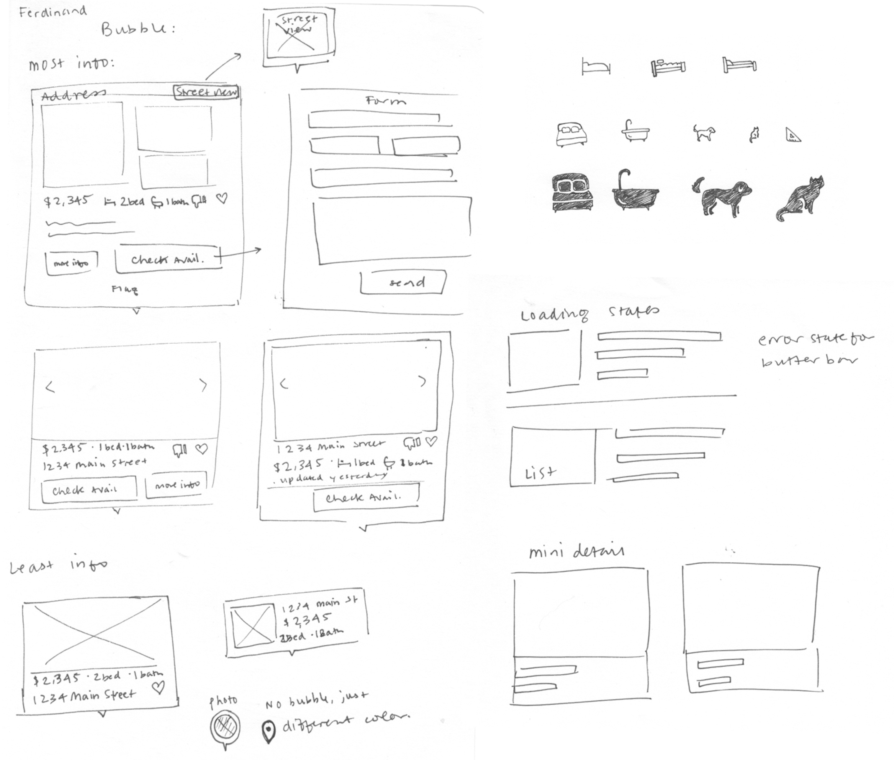
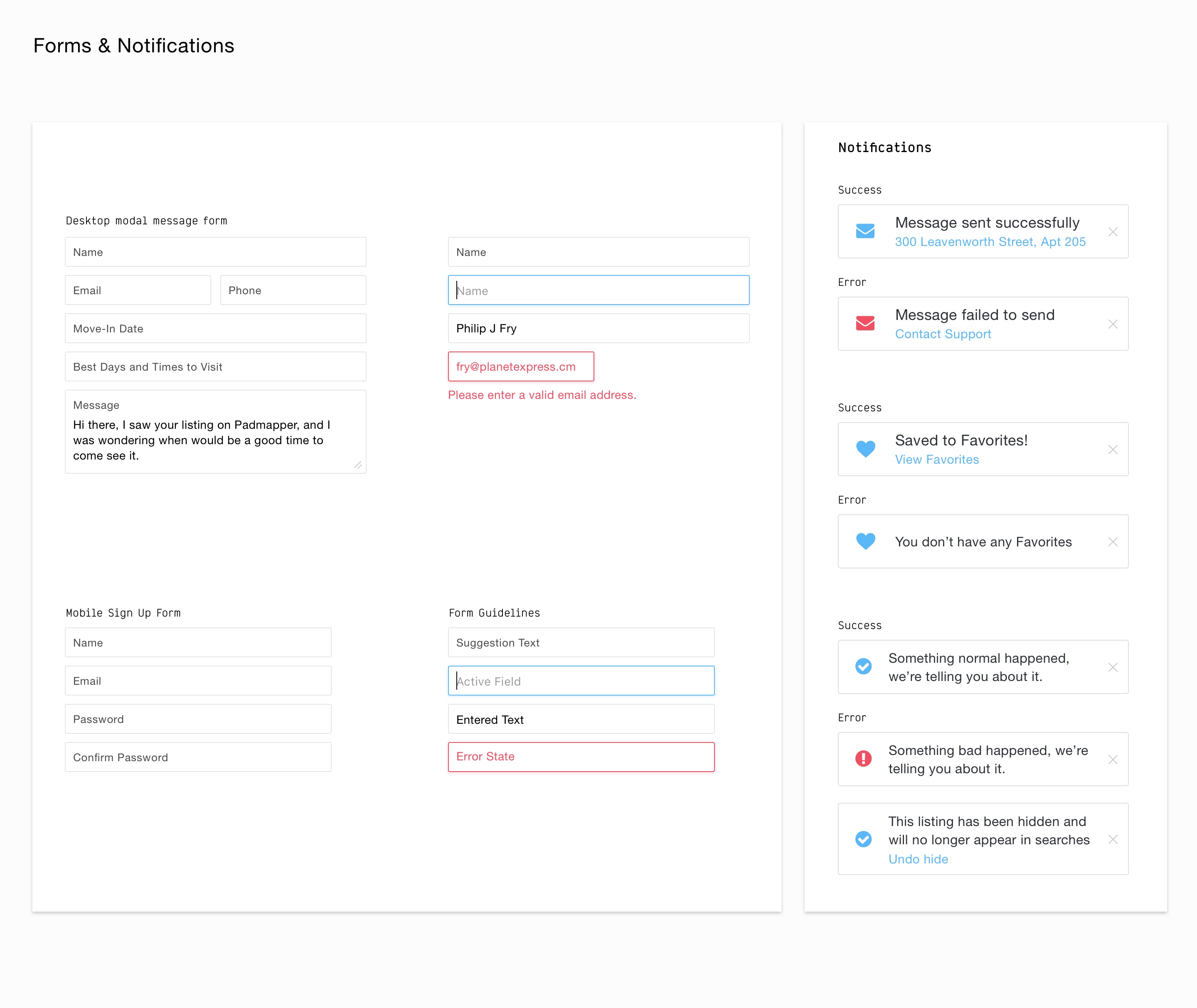
I added much needed breathing room throughout the interface that our older products don’t have. I also took full liberty to insert a bit of personality and quirk throughout. I drew a set of icons for quicker understanding of general amenities and description of units, and we planned messaging forms for clarity and simplicity.
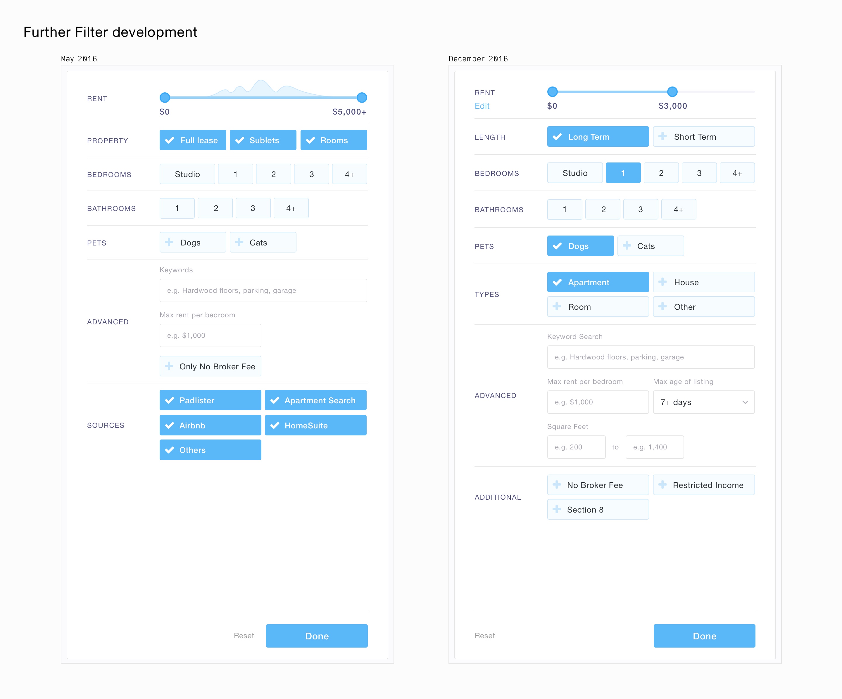
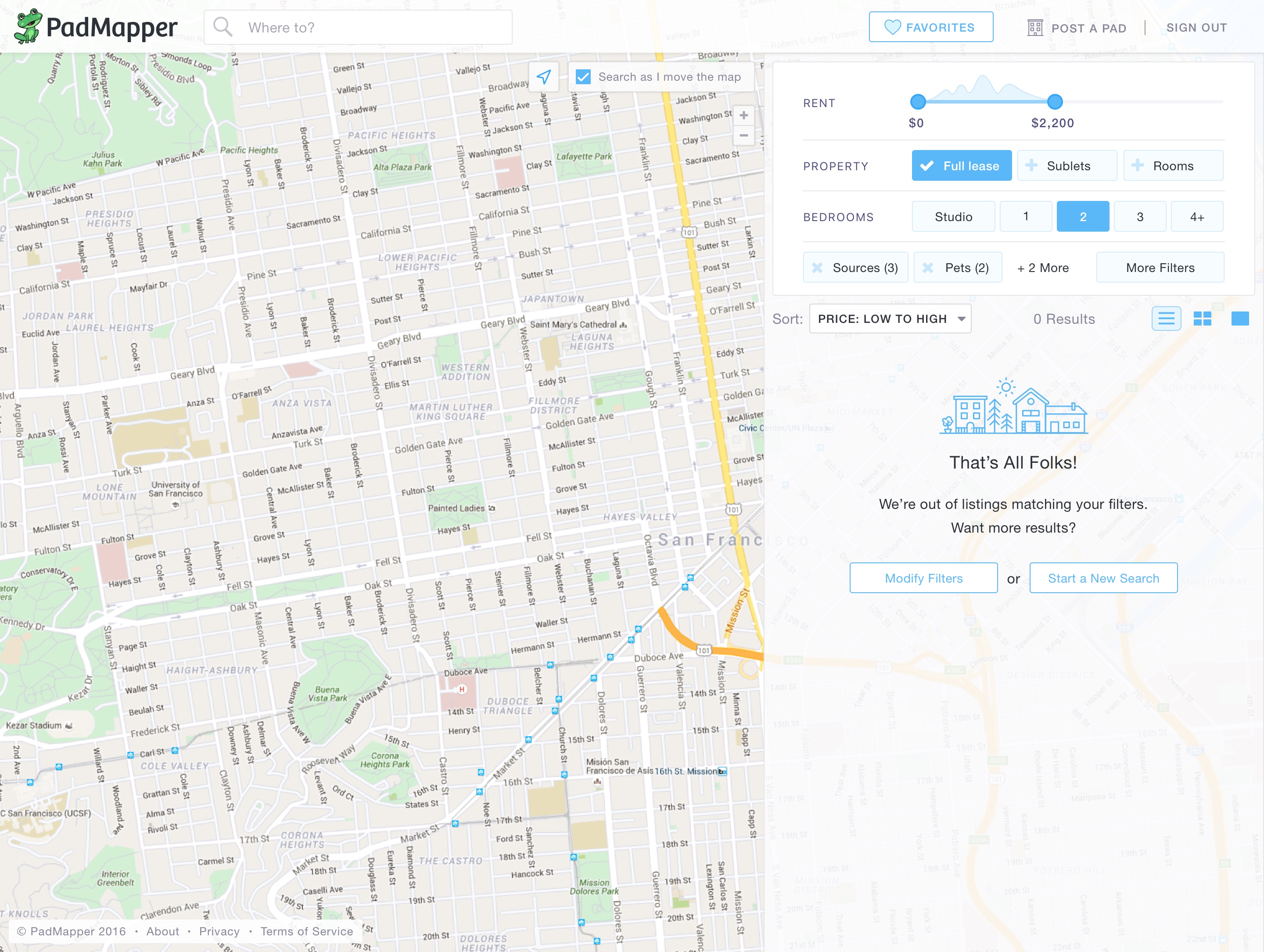
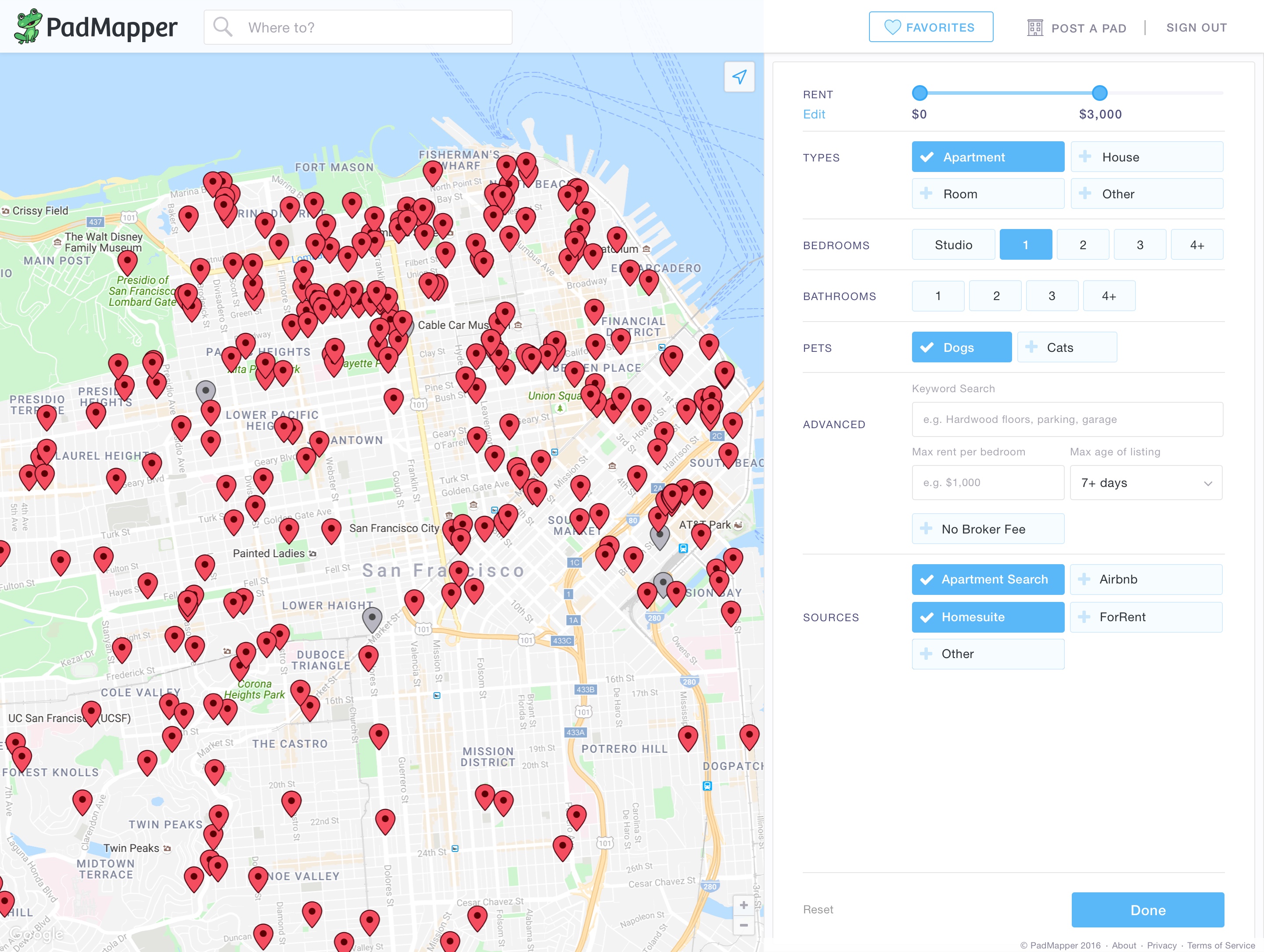
Filters
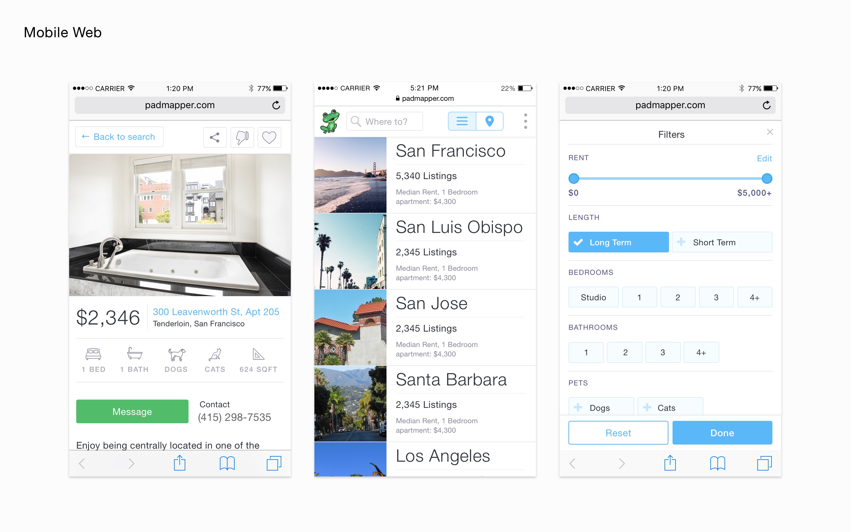
At this stage, we broadened our core team to get feedback. We then began to think more critically about the user interactions, in particular, the filtering experience. While PadMapper’s filtering featureset is a bit lighter than Zumper’s, it was still a complex problem to explore.
I began by experimenting with a few different formats: filtering in a pop-out card, filtering as part of the top navigation, as well as the possibility of a modal. We determined that constraining every tool to the side panel would feel the most natural, then identified a narrow set of filters to include in the first version. The modular structure provides clarity, helps determine logic between various tools and actions, and helps for quick scannability.
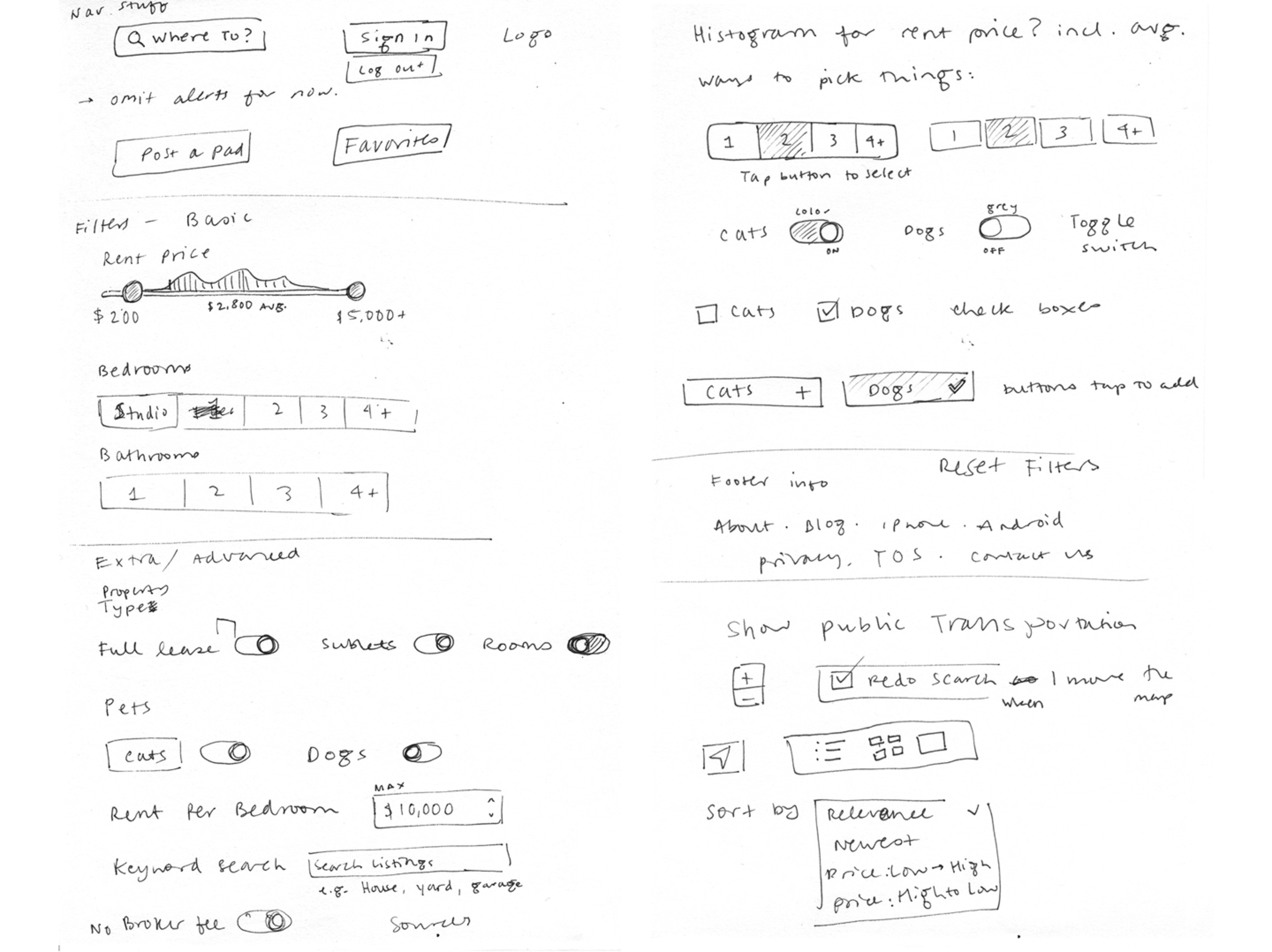
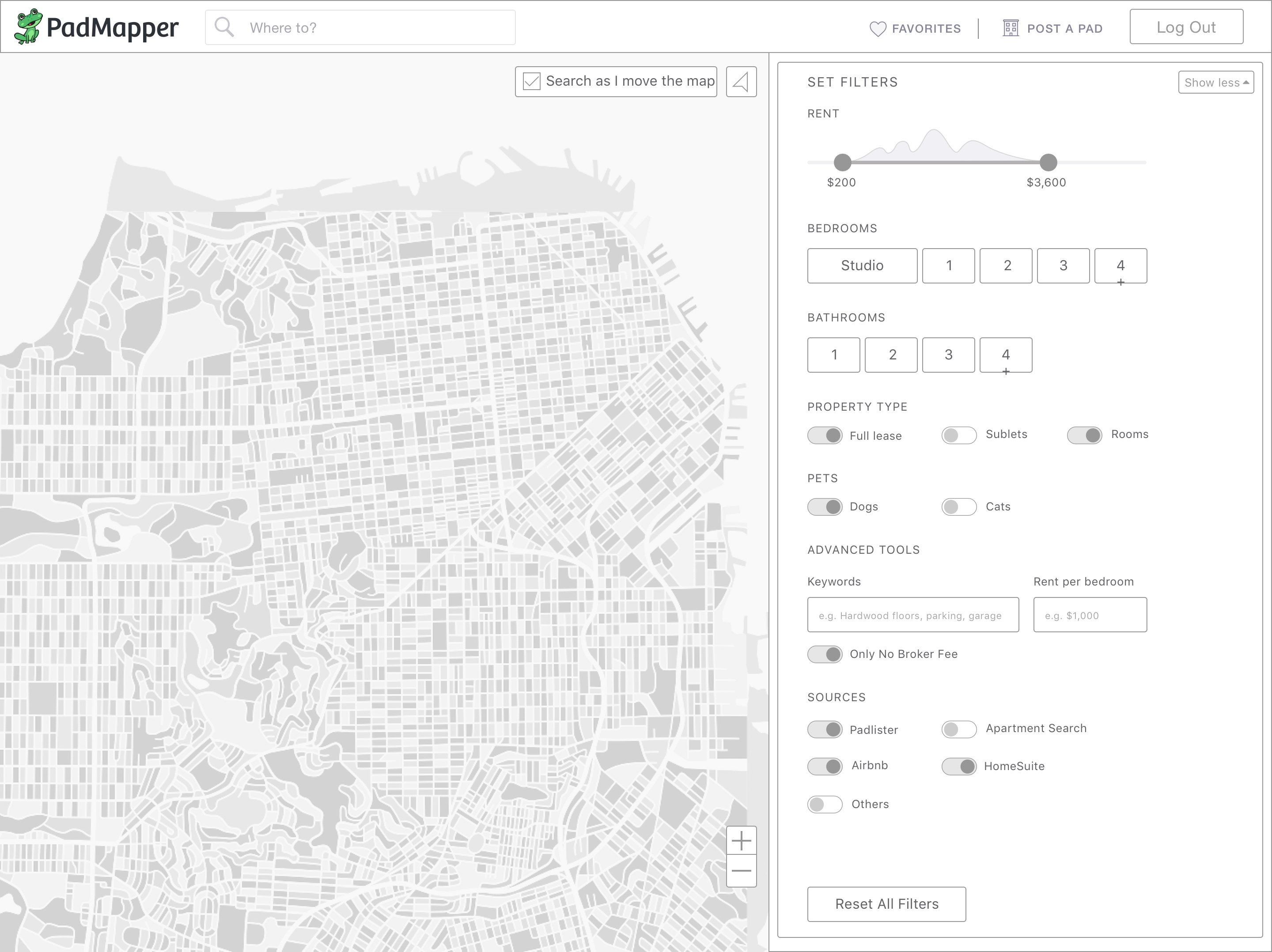
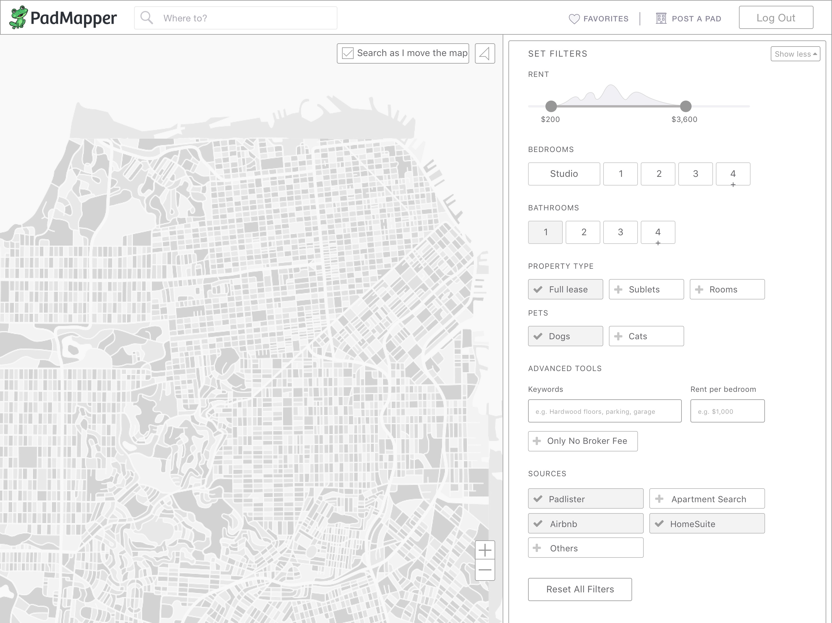
It was crucial that these controls lived in a system that could scale as we improved and changed the product, since we were starting with a small set. The core list of valuable filters to show on first load would give the user the most basic tools immediately, revealing a wider set of options and controls in an advanced menu.
One more thing
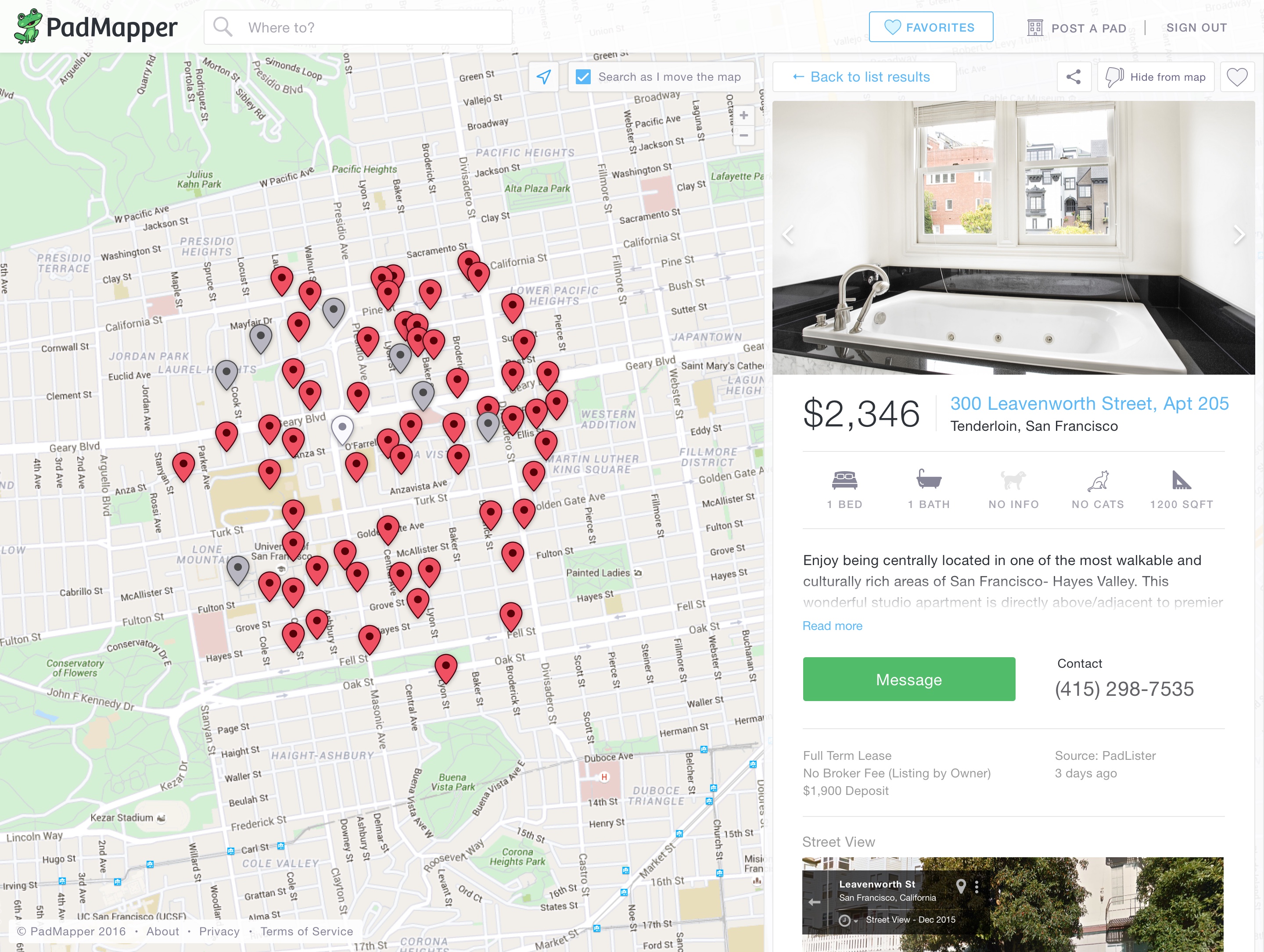
With most elements of the experience designed, there was one more thing to consider: what happens when you click on a listing, either from a map pin or from a card view in the side panel?
Zumper prioritizes a full listing page that loads as a new page, packed with tons of information. With PadMapper, we decided to try a leaner approach to encourage speed of browsing and reduced navigation. Plus, we were working within a constraint of not redesigning the full detail page for this first version. We really needed to nail the “mini-detail” experience.
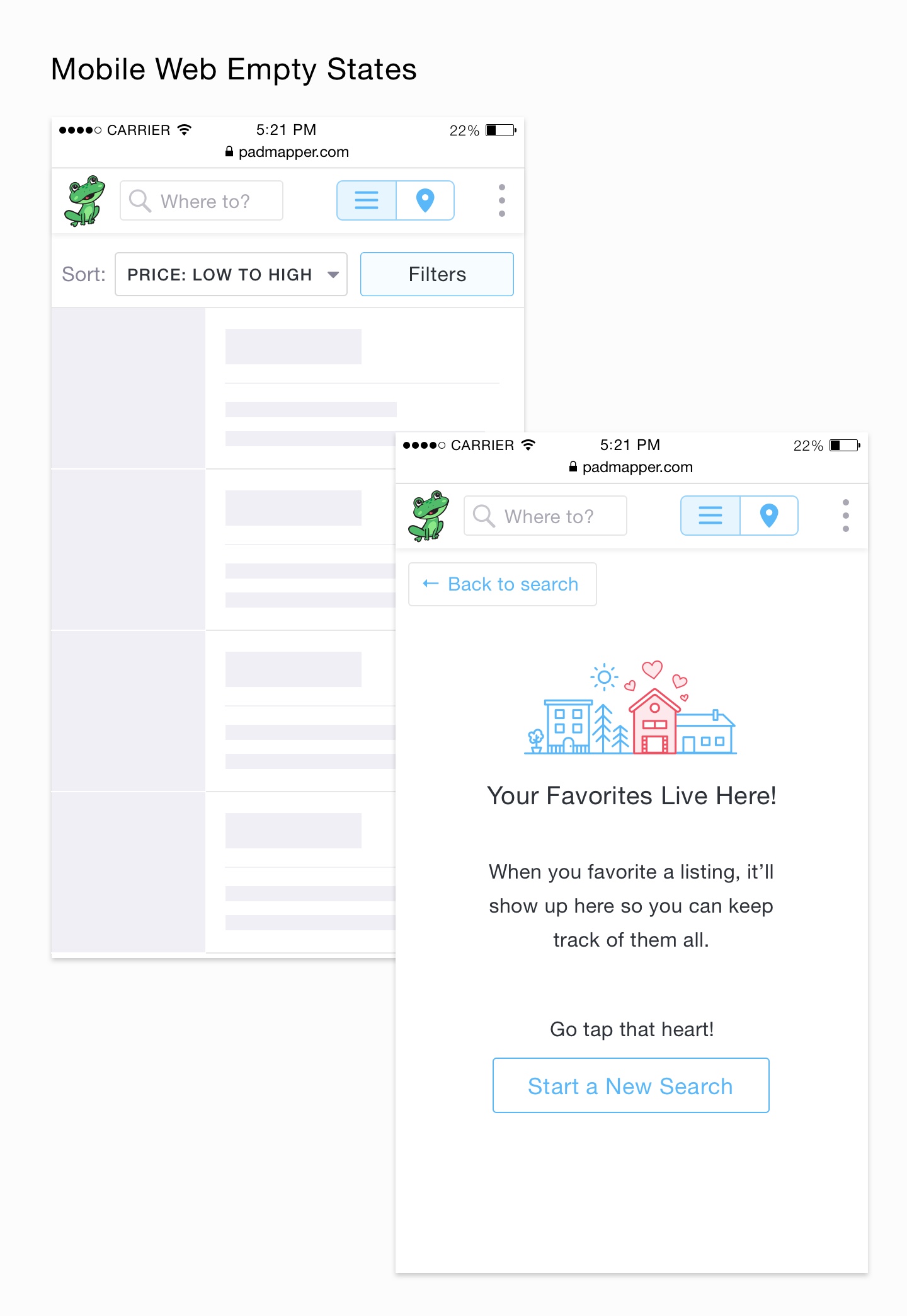
We first determined the most important information for this view; it would be a simplified listing view that expanded on the core listing information initially seen in the list card views. Our goal was to make sure the user had the information she needed in order to feel comfortable sending a message to the listing without needing to open a new tab. We made the decision not to do a mouseover element in the map attached to a pin because we felt it didn’t add any new information or value over what the list itself had to offer.Having a thorough and robust mini detail meant the user could spend more time accomplishing her tasks in our product because she could explore listings without friction and without getting lost in a new tab and forgetting to return.
Having a thorough and robust mini detail meant the user could spend more time accomplishing her tasks in our product because she could explore listings without friction and without getting lost in a new tab and forgetting to return.
Mostly Done
In May we were “ready-to-ship” with desktop, though we continued to iterate afterwards, and there was still much to be done on mobile web.
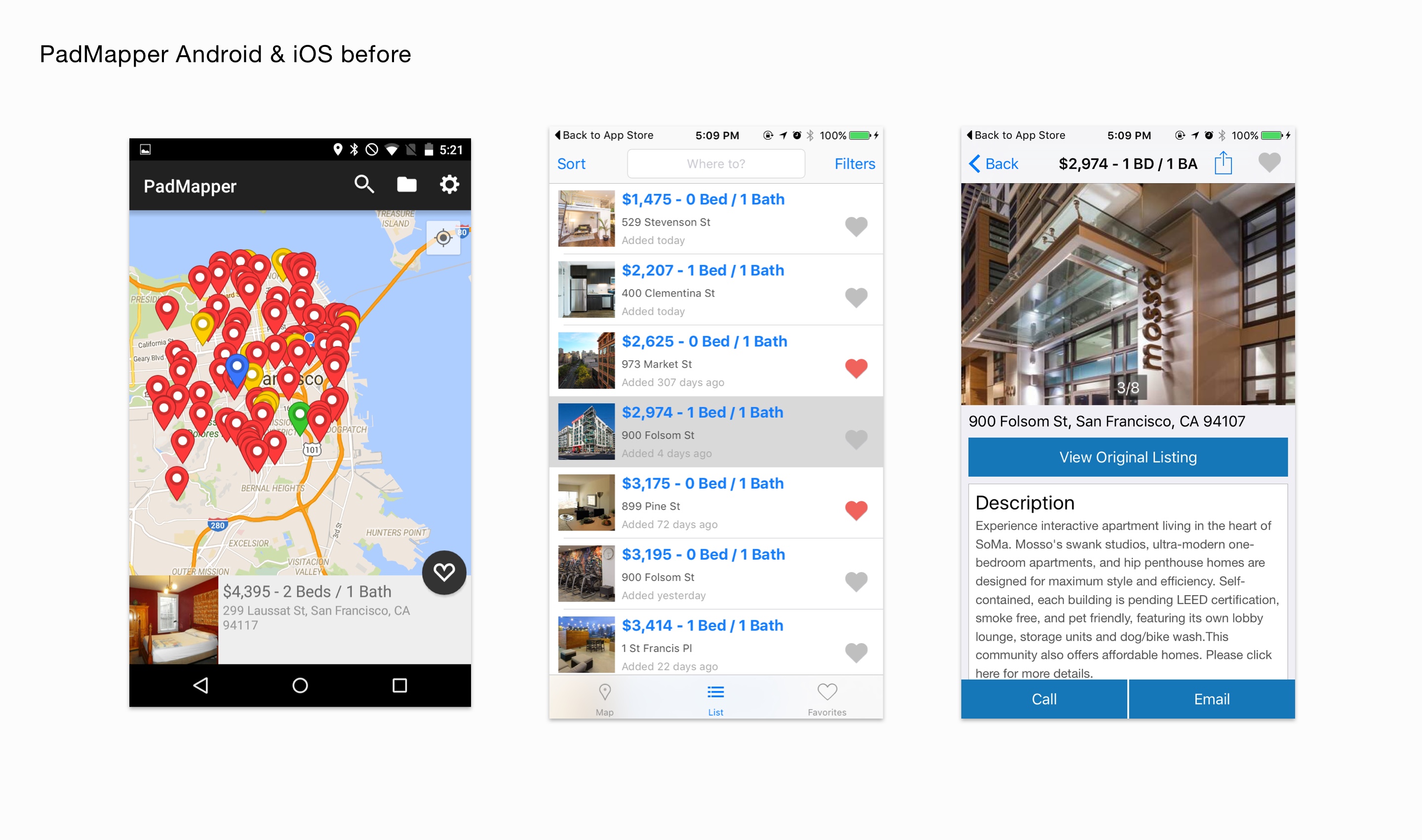
Mobile First
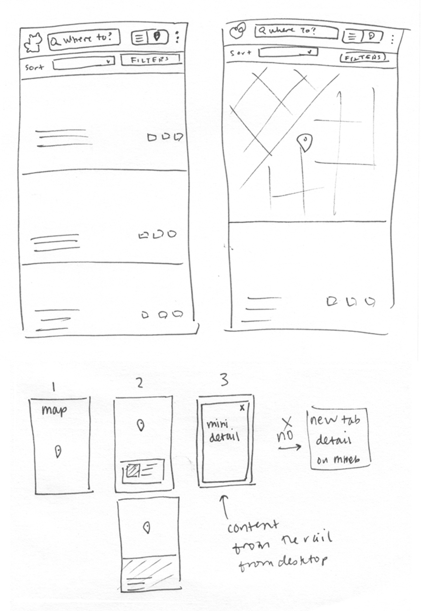
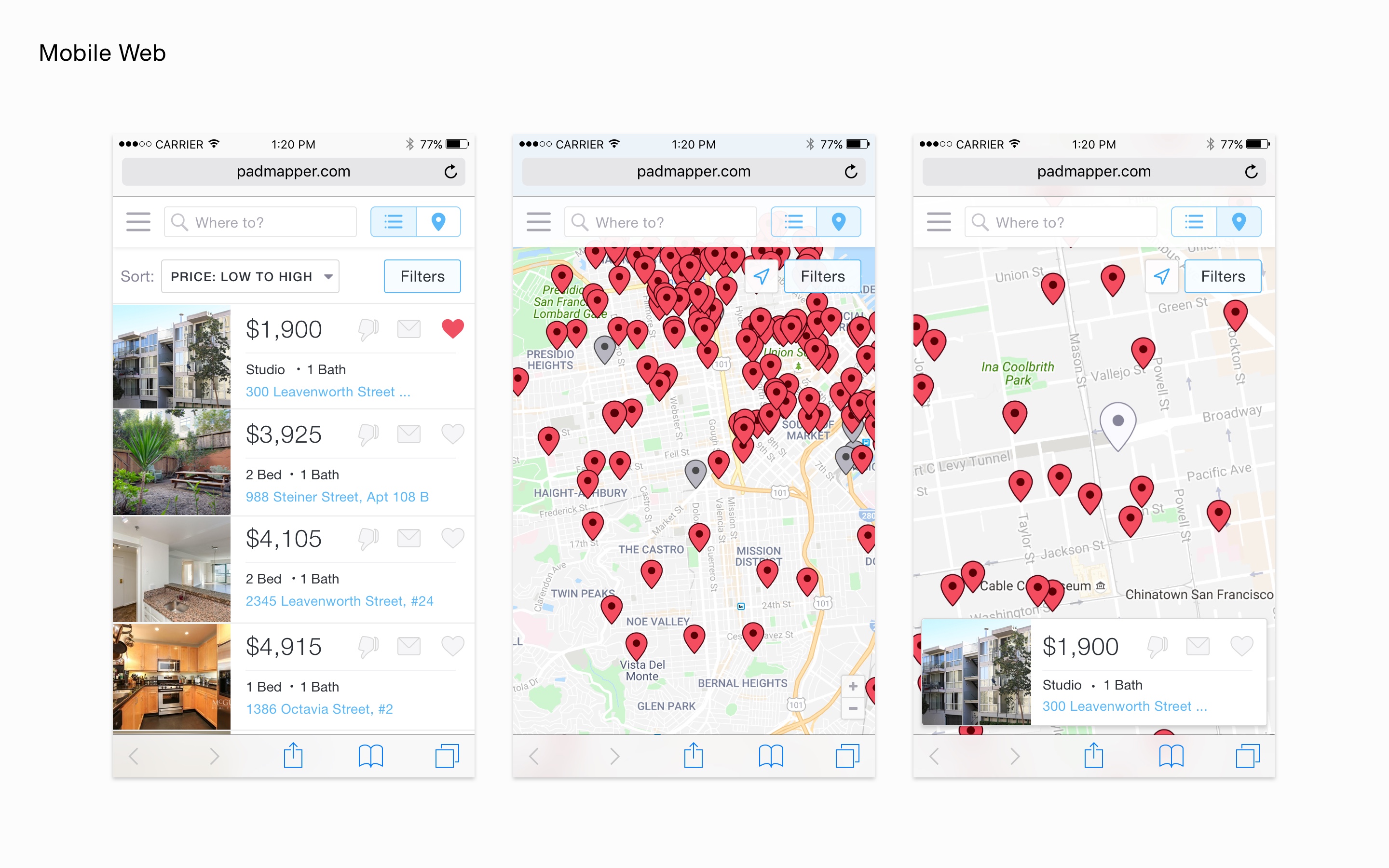
(technically second) As Nico and Yewon, one of our front-end developers, turned their attention to building, I turned mine to mobile web. Most of our users are on desktop, but PadMapper’s mobile web experience needed a lot of love. With our desktop experience fully fleshed out, I sat down with a pen and paper to determine the most valuable tools for a mobile experience.
In the desktop experience we offer three different ways of consuming your listing information: dense fast-consumption list, just-right side-by-side tile, slow-yoga-pace big images. However we limited this to one experience, with a dense list view to accommodate screen sizes of all types.
Since we designed modular filters, the mobile version came naturally, so the bigger challenge was determining the content for the detail page and how to show information from the map view. We thought about skipping directly from the pin tap to the full detail, but that felt a bit abrupt, so we took one of the list items and placed it on the map so the user could get more information without losing context.
Looking Forward
While new-PadMapper is still a very young product, we now a have a sturdy technical foundation in place alongside a scalable design system. It was a major feat for us to develop such a high-caliber product, completely from scratch in just a few months, with a team of under ten people.
And without telling you any details, we did increase conversion! People spend more time on our site now than they did before, and convert to leads at a higher rate. The improvements are most visible on mobile web.
Thanks Yewon, Nico, Tae, Rob, Russ, Anth, Woody, Eric, Tanguy... the list goes on. I’m really proud of everyone who helped build this, and so honored to have gotten to be the sole design mind on a massive undertaking. I love working with this talented team and I’m really looking forward to continuing to hone in on a sharper and sharper tool.
We’re just getting started.
Originally published on the PadMapper blog in December 2016