Path Product emails
I actually enjoy designing emails. While many designers complain, I delight in the constraints across multiple platforms, devices, and email clients, compared to the responsive web, where anything and everything is possible.
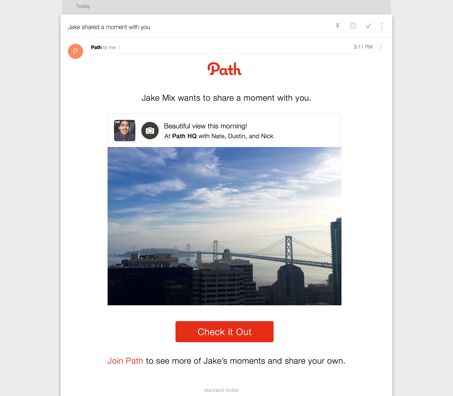
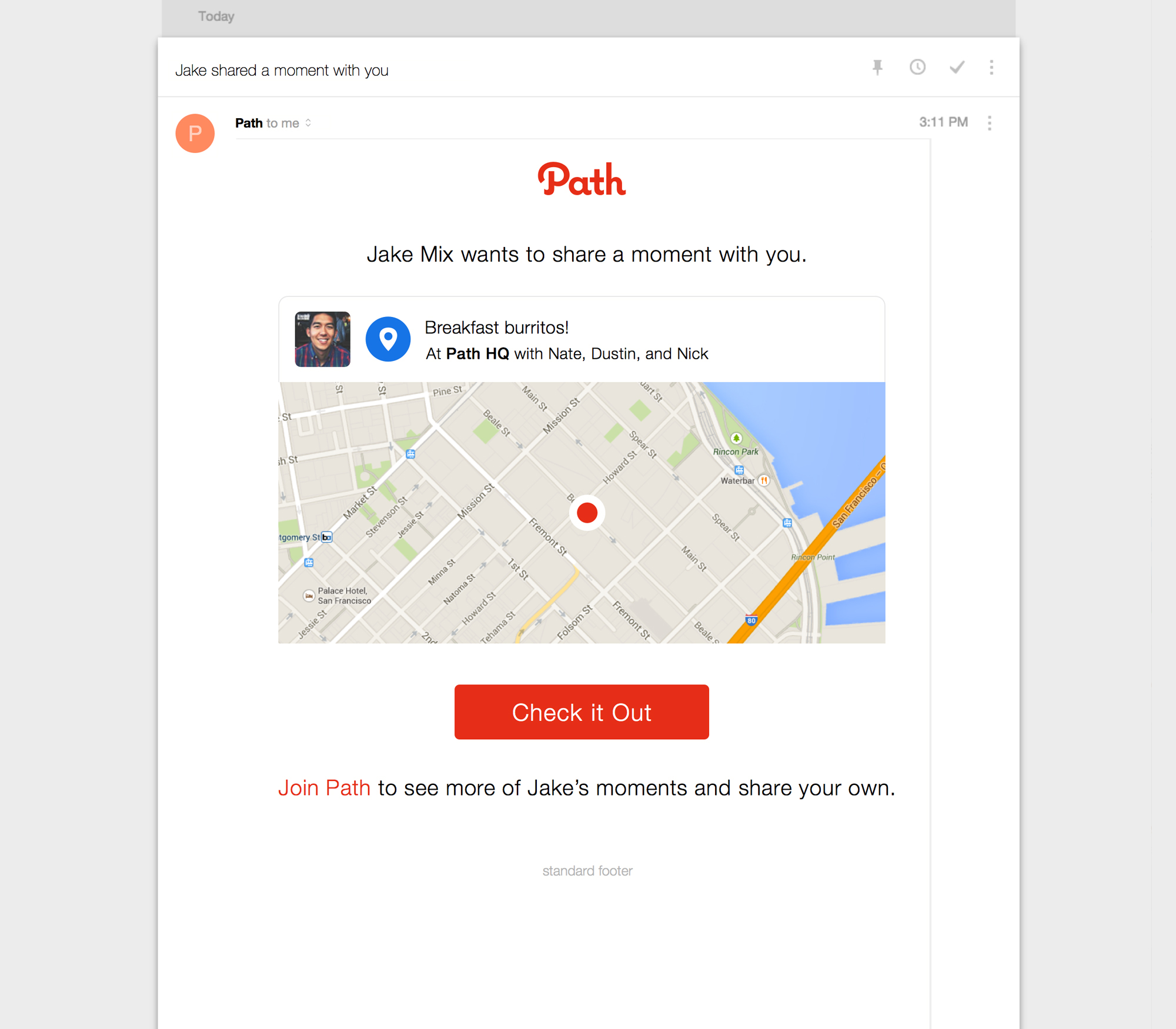
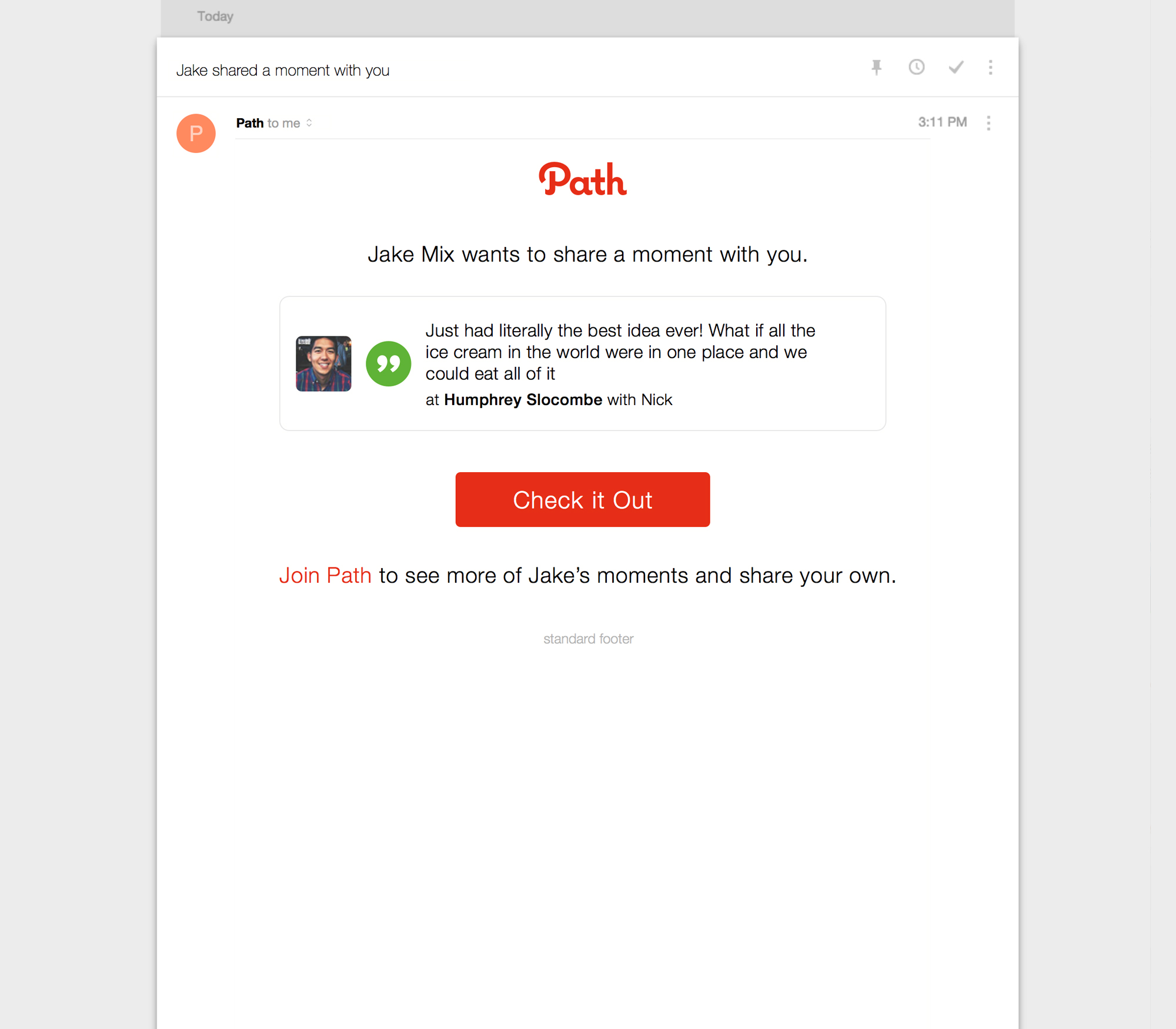
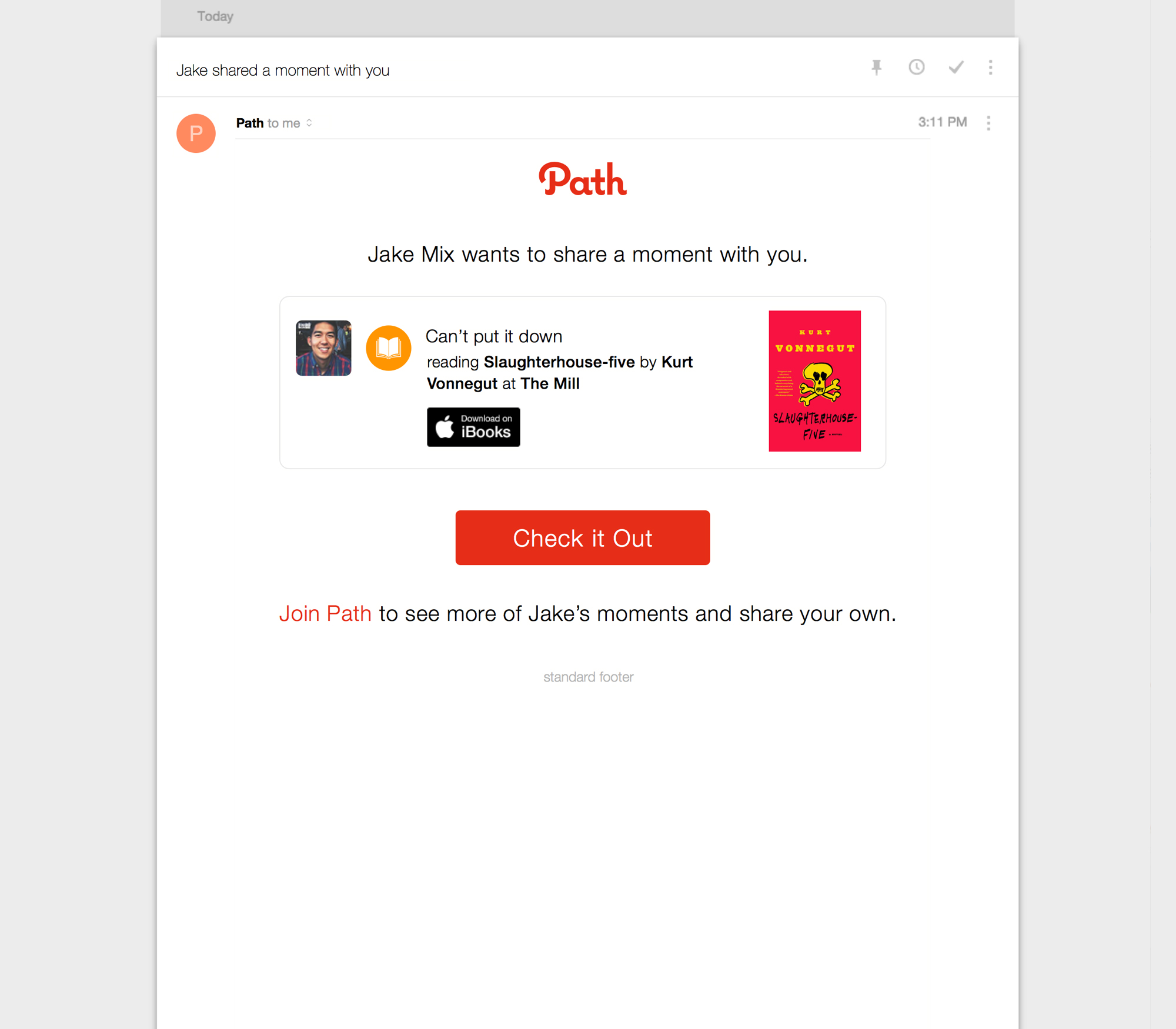
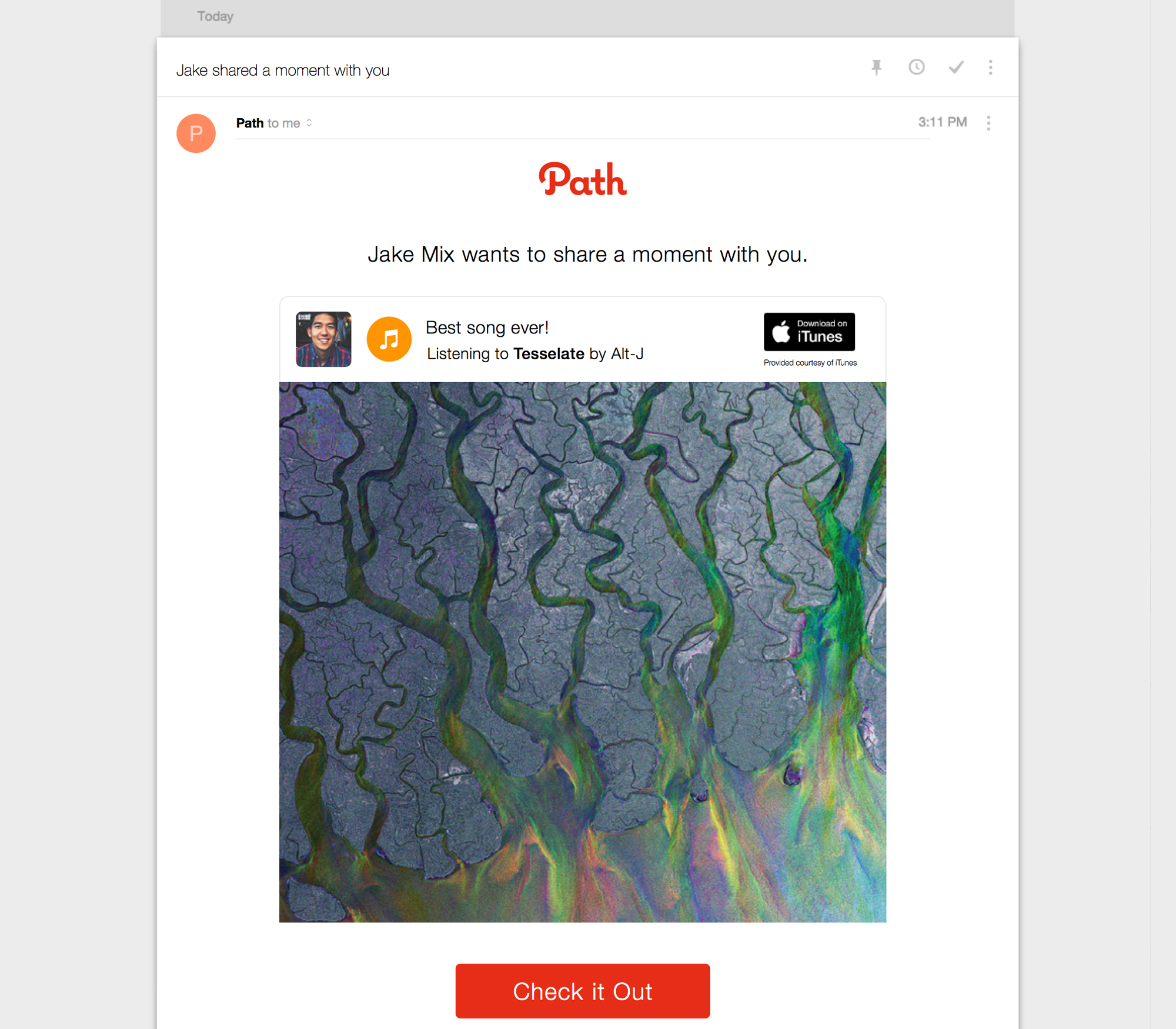
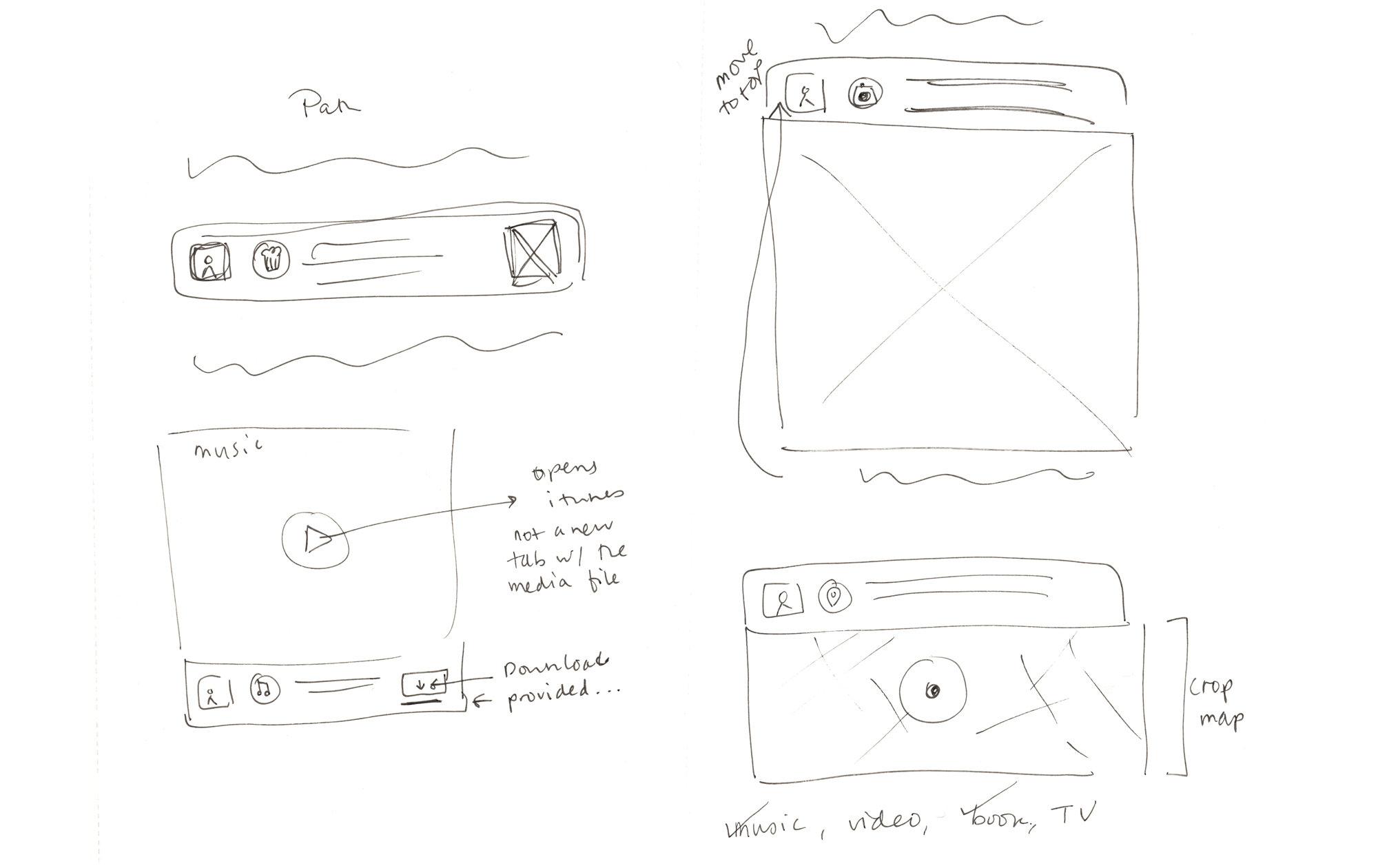
At Path, I designed the share emails sent to both users and non-users when someone taps the share-to-email button in the Path client. This creates a permalink, which makes the Path moment viewable from web. Typically, all moments are private, except when syndicated across multiple media platforms, including email, a public permalink is generated. The challenge here is that some of the different moment types are only viewable from the client, and the web-view can be truncated. The most common context is typically someone wanting to share a photo they took with a non-Path-user, who may be unfamiliar with mobile and technology. I designed this series of emails in tandem with a web client for Path, which has so far only been a mobile product. The emails were even featured on a popular blog, Really Good emails. We saw a marked increase in interaction with permalinks once the emails improved and allowed you to see the content right away.
Lookout Product emails
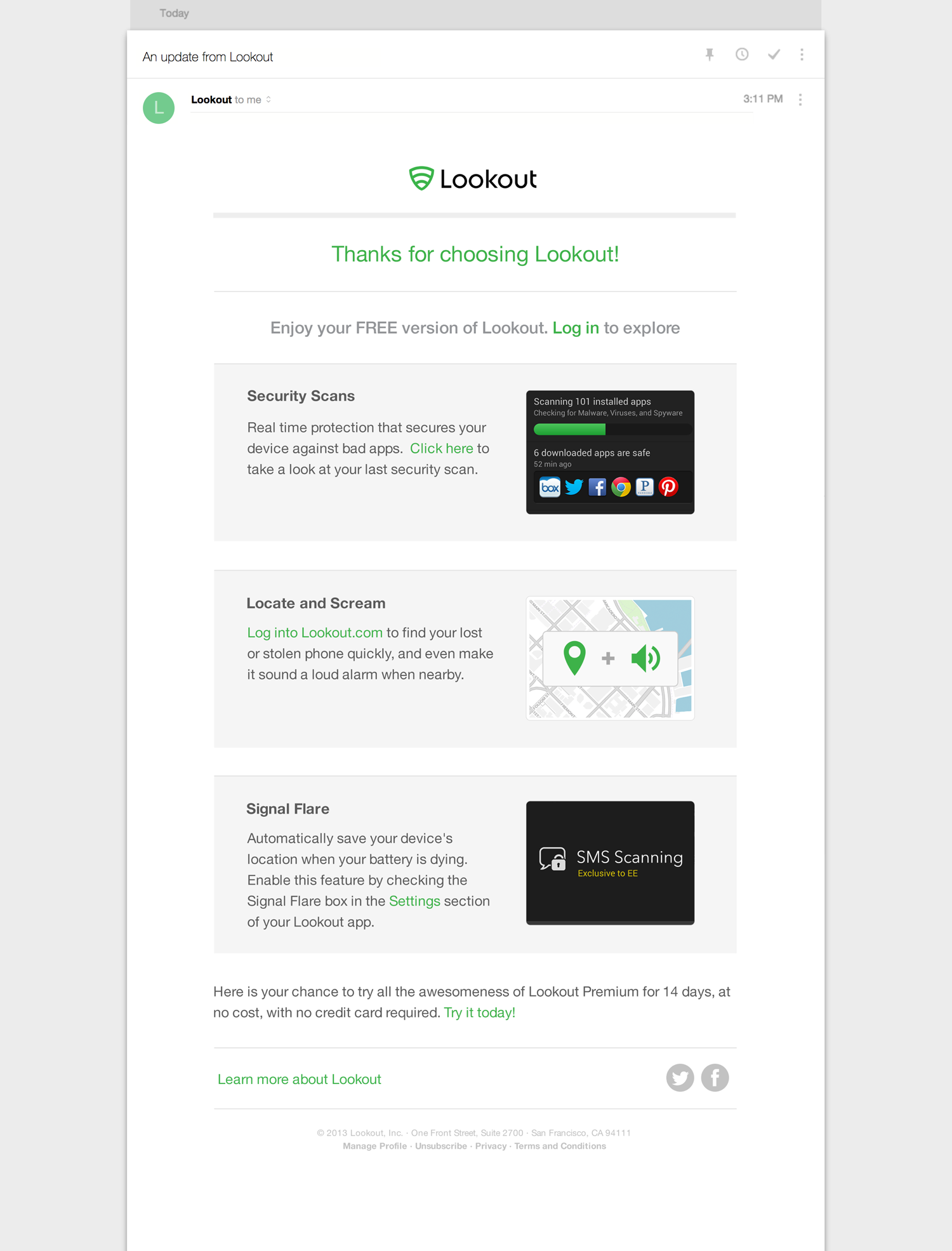
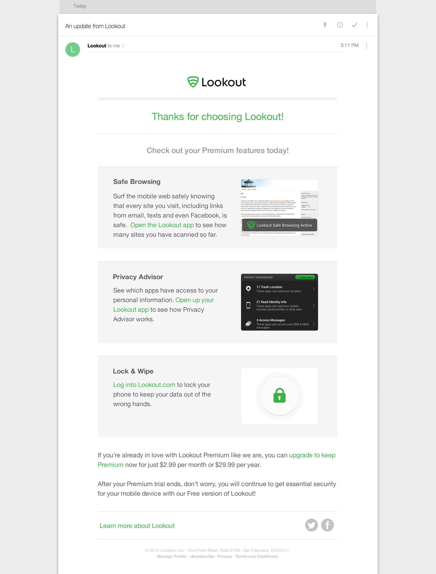
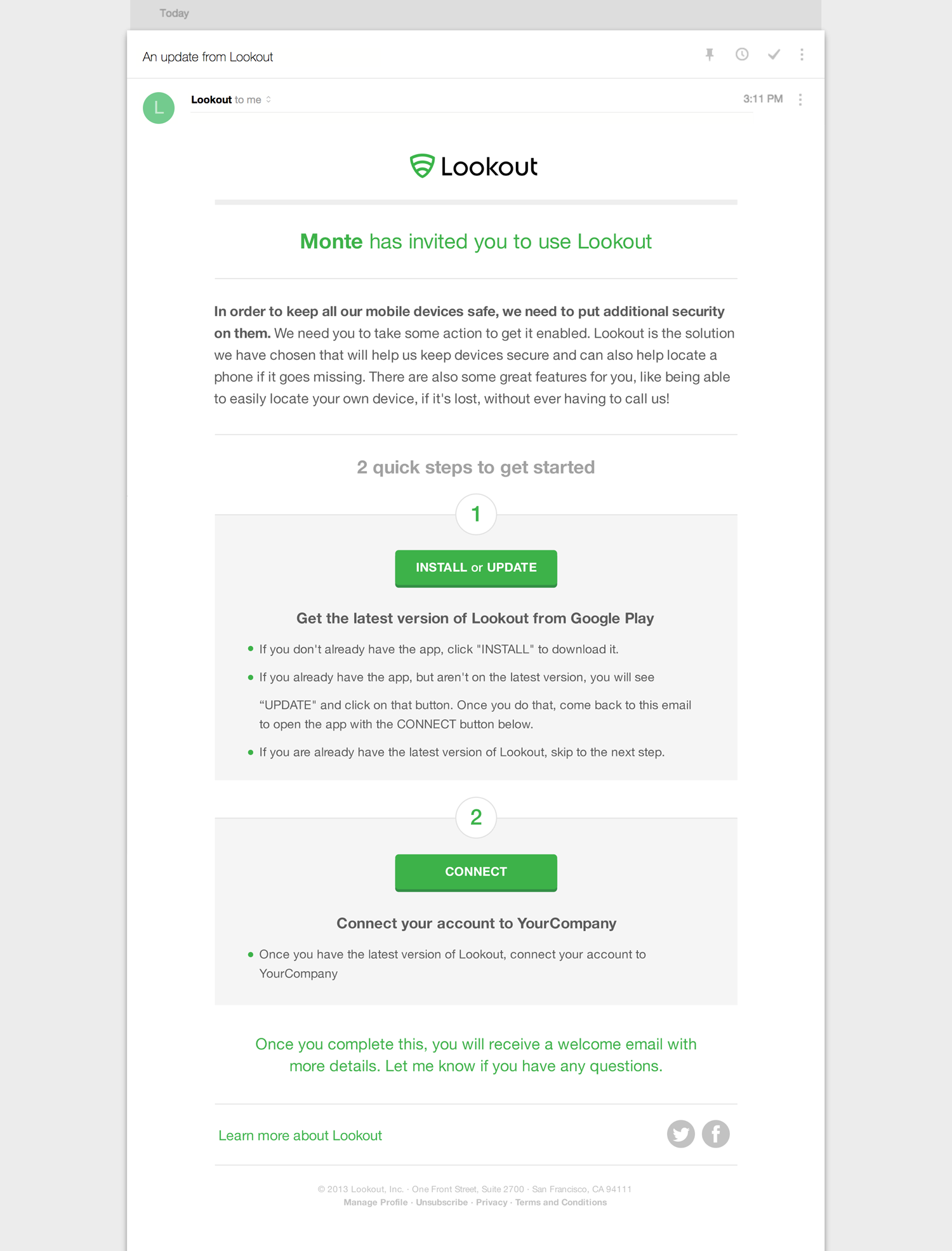
At Lookout I designed several emails over the course of my time there, mostly focusing on the two week trial period for free-to-premium (freemium) customers who had just converted to the premium product, as well as the small-to-medium-business endeavor, Lookout for Business (which has since changed to enterprise).
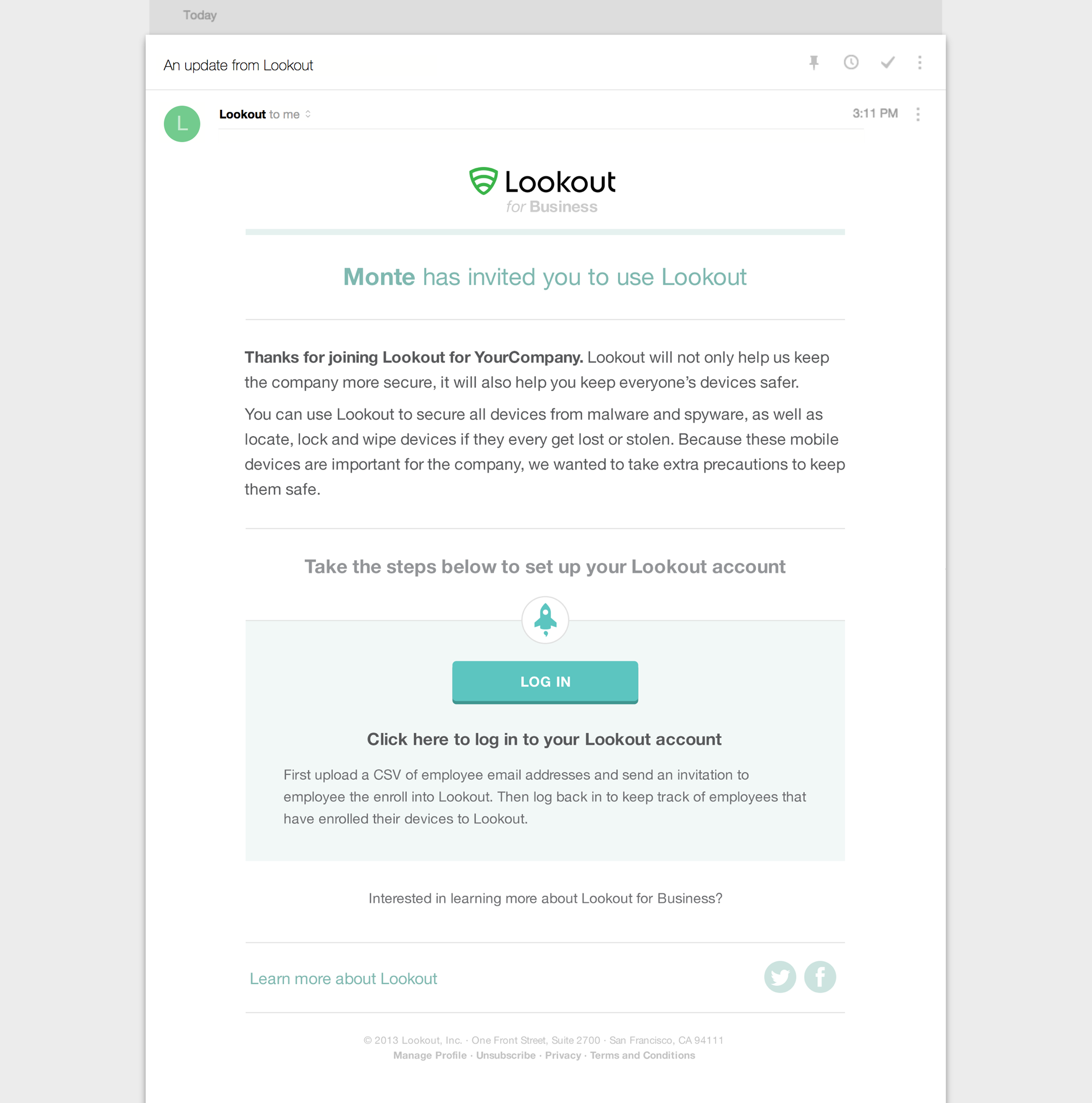
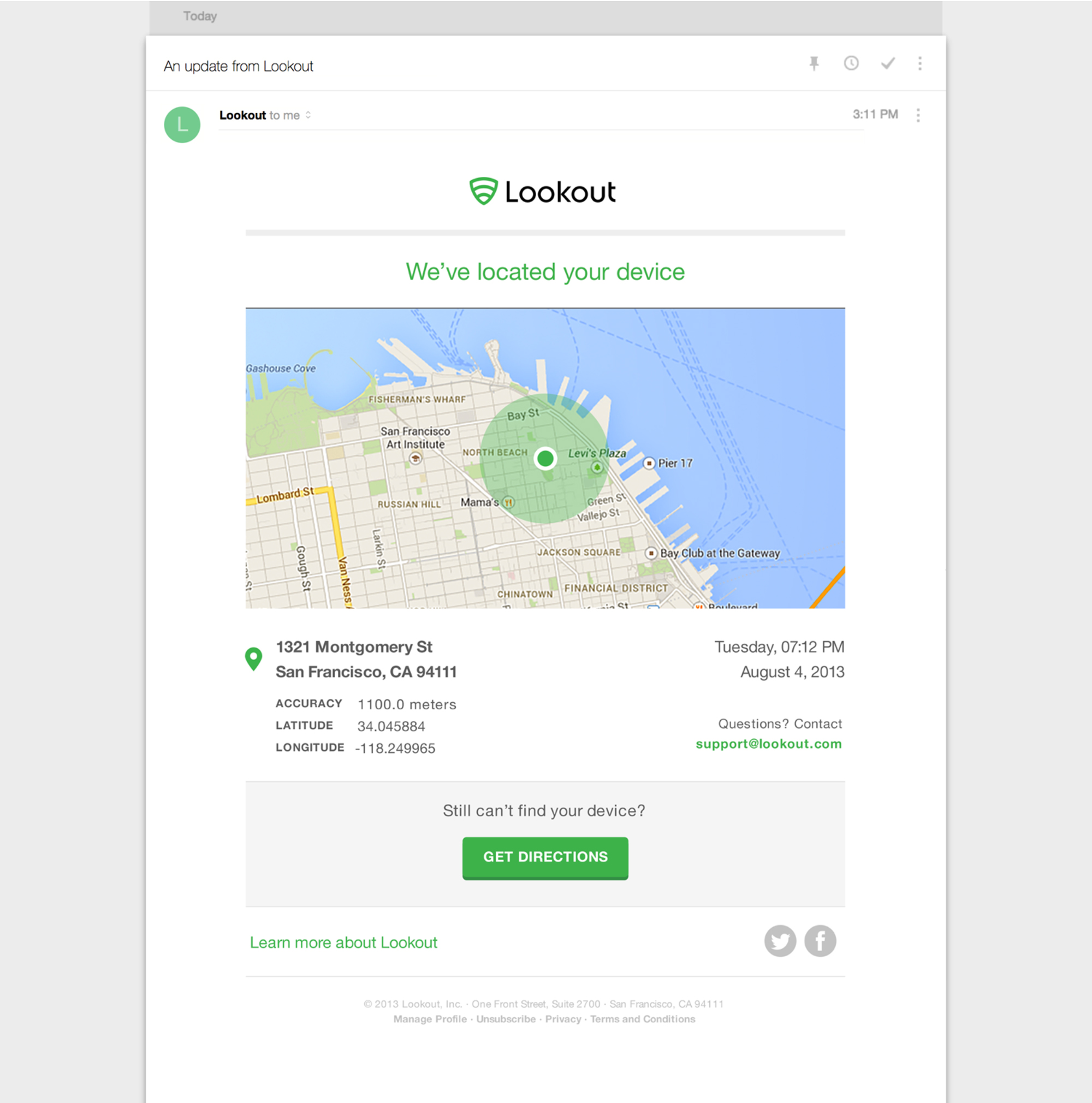
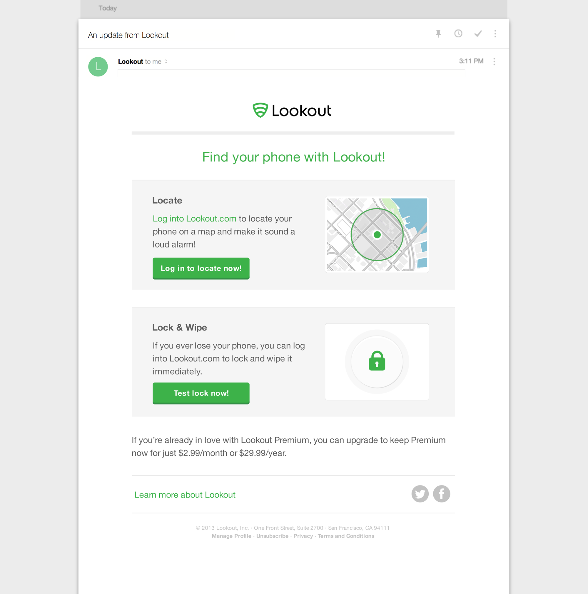
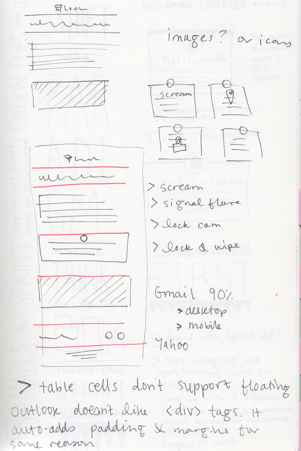
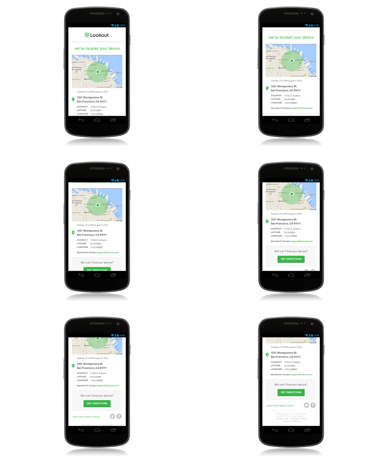
Based on data, we knew that nearly 90% of our users were opening the emails in gmail on an Android device, and most of the remaining portion were using Microsoft Outlook on a desktop. Using this information, we created series of responsive emails for each audience, depending on the project, to clearly articulate calls to action and information across varying platforms. The business customers required much more verbose emails, which can be a challenge.
