minimalism: type & image
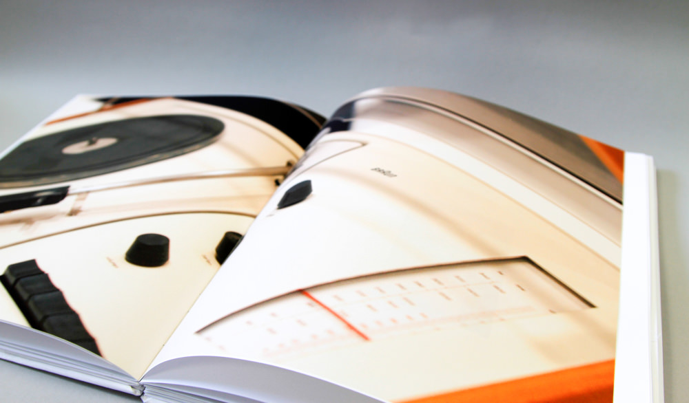
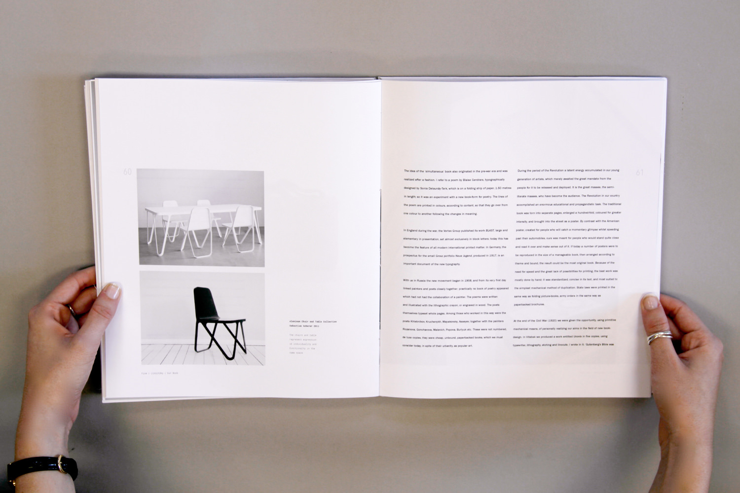
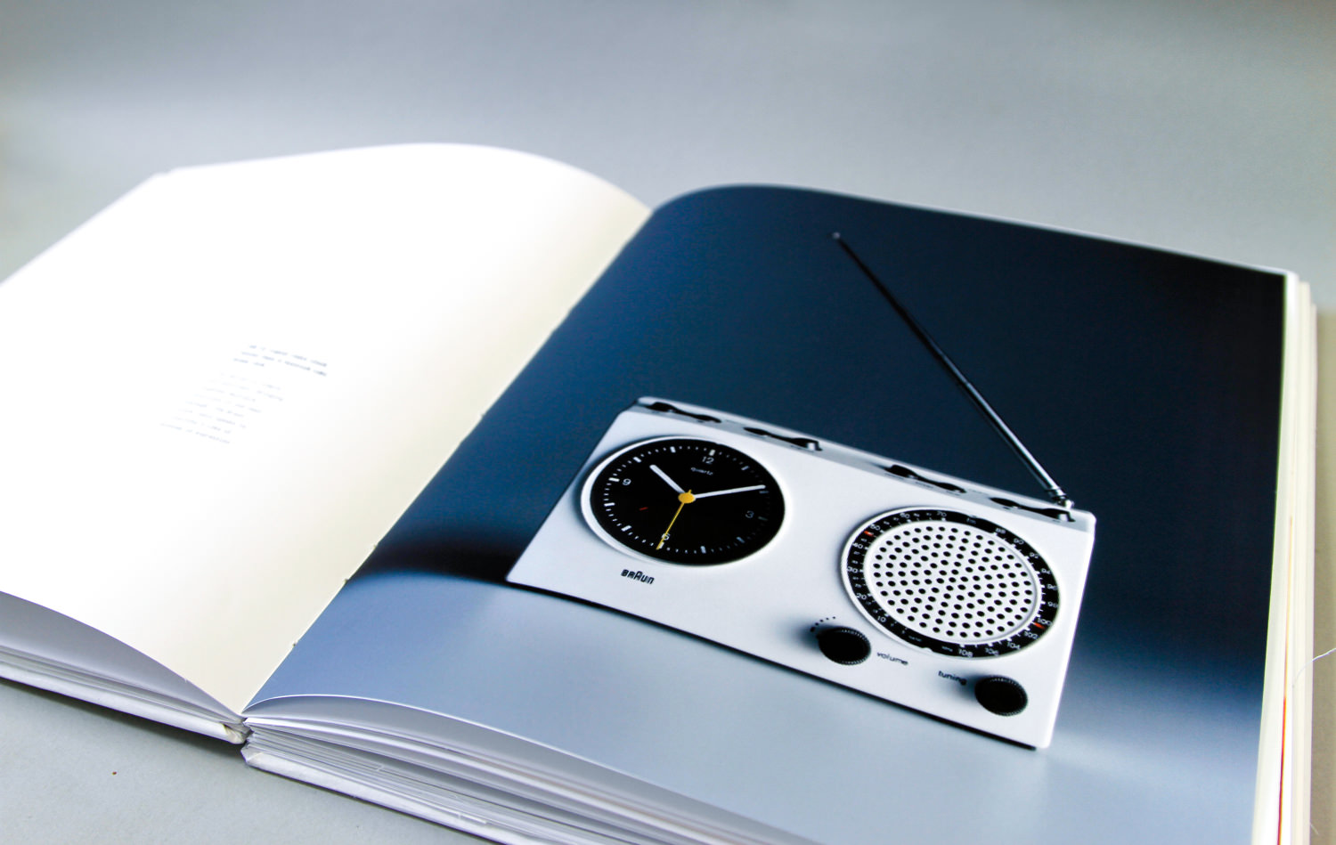
An exercise in organizing multiple voices, this book captures four lives, four stories, an elegant juxtaposition of disparate parts. I arranged three typographical essays alongside photographs of three dimensional design over the last hundred or so years, encapsulating their teachings in a distinct visual pattern.

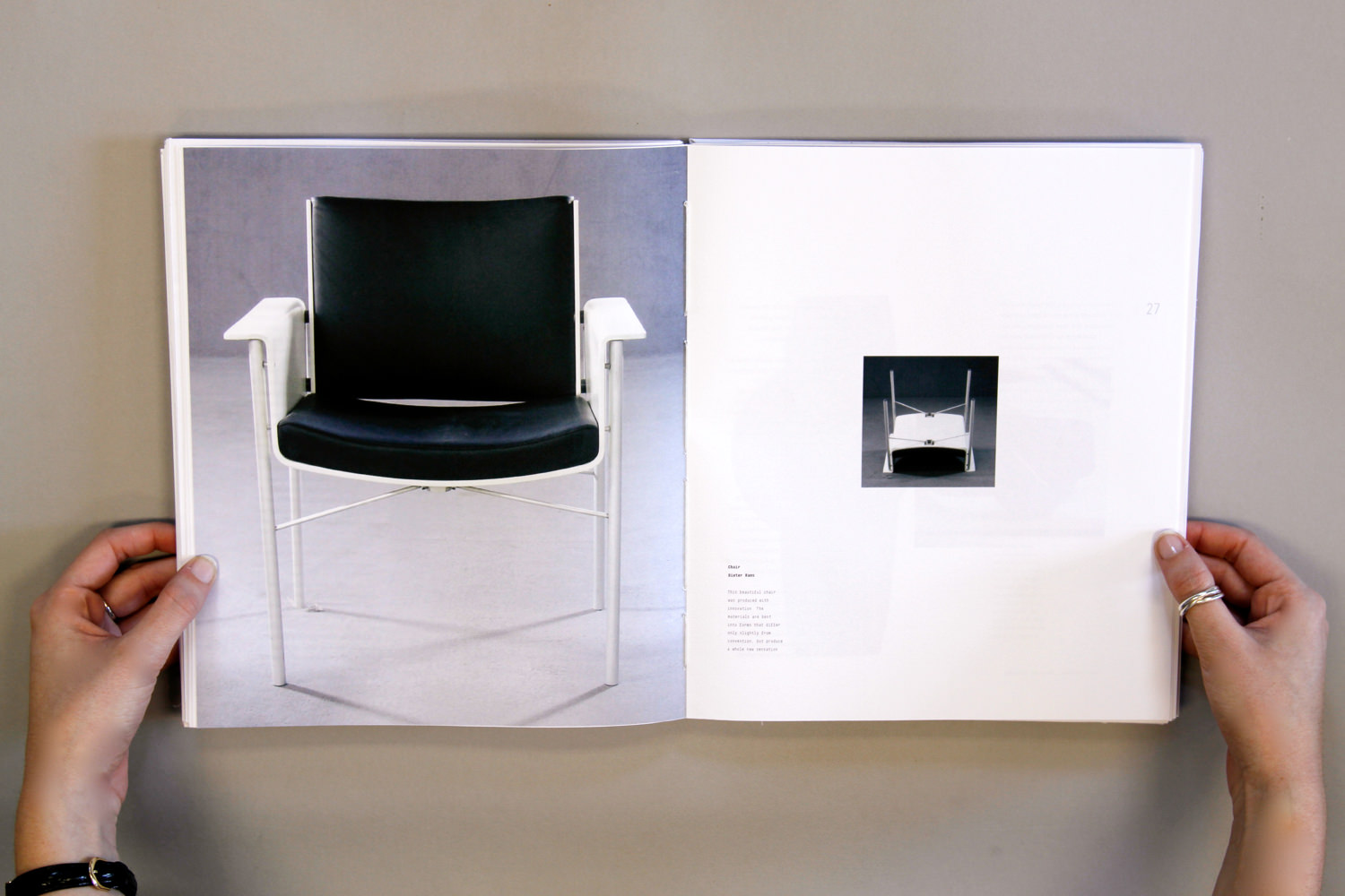
Three essays on typography, written by famous typographers and designers from the last century, each influential in their own fields. Beatrice Warde, American designer, Dan Frieddman, also American, a radical modernist, part of the New Wave Type in the 1970s, and El Lissitzky, a Russian designer well-known for his work in the Constructivist, De Stijl, and Bauhaus movements. The fourth voice: a visual juxtaposition for the thoughts illustrated in each of their essays, mid-century modern furniture and industrial design, with a focus on Dieter Rams, which is when I first learned about his influential work.
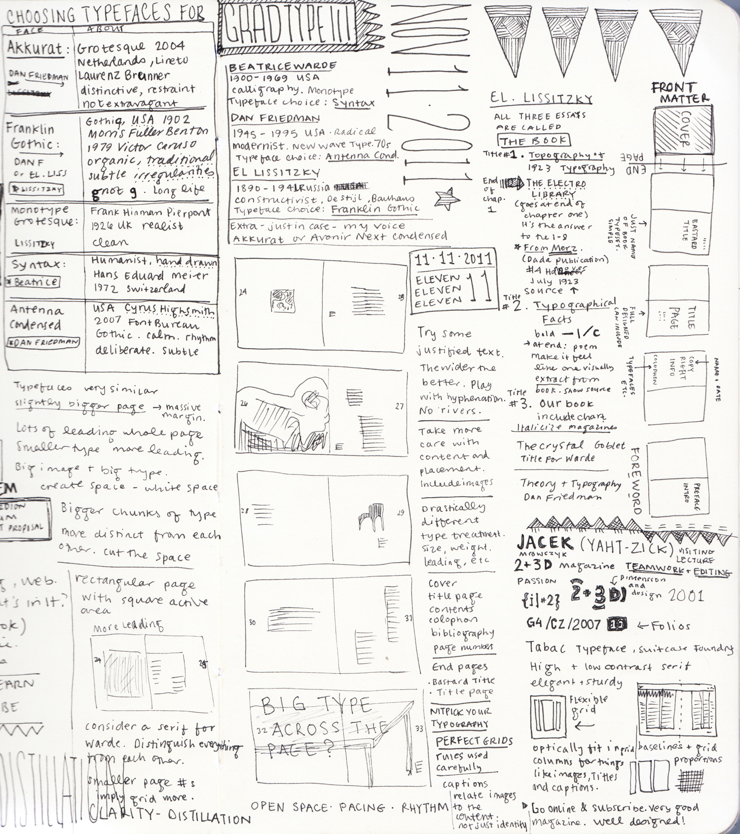
I focused heavily on process in designing this book. Several different iterations of combining their voices. Was this a simultaneous chorus throughout the whole story? Each designer singing a different tune? Or were they divided into distinct chapters, one after the other? I put a lot of thought into which typefaces made the most sense as a visual representation of each designer's voice. Humanist for Warde, Grotesque for Friedman, Gothic for Lissitzky.
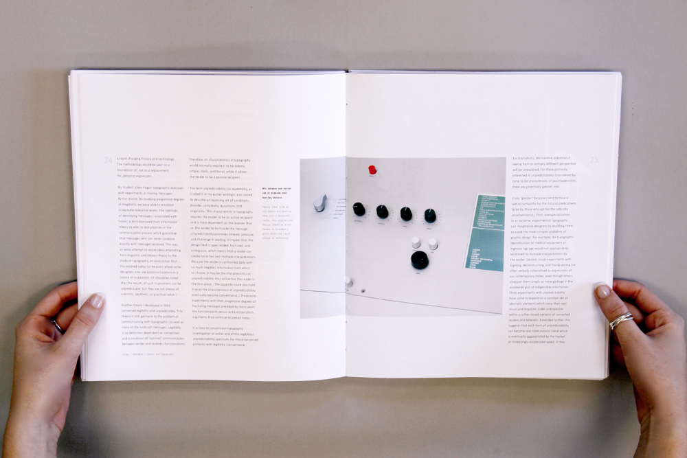
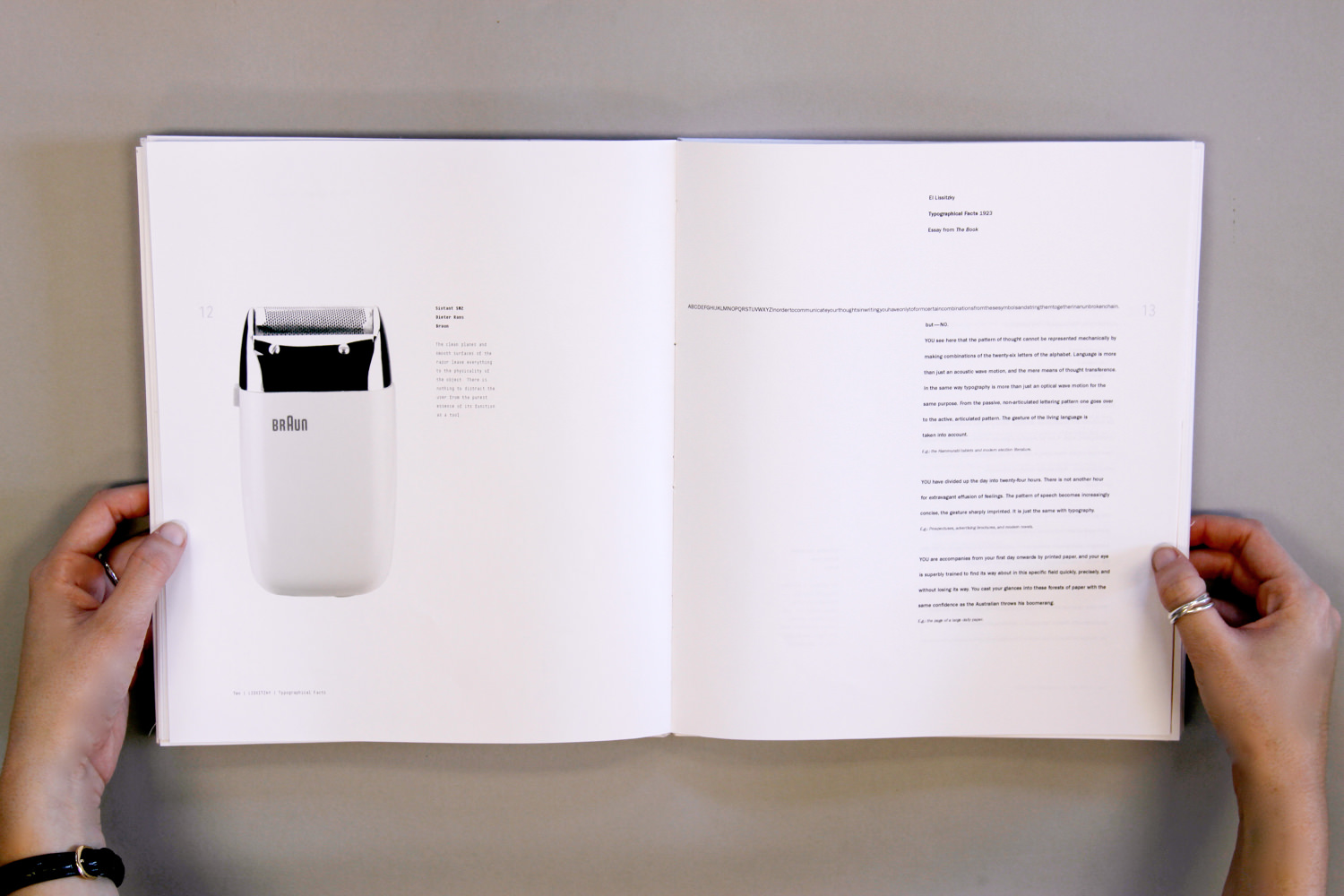
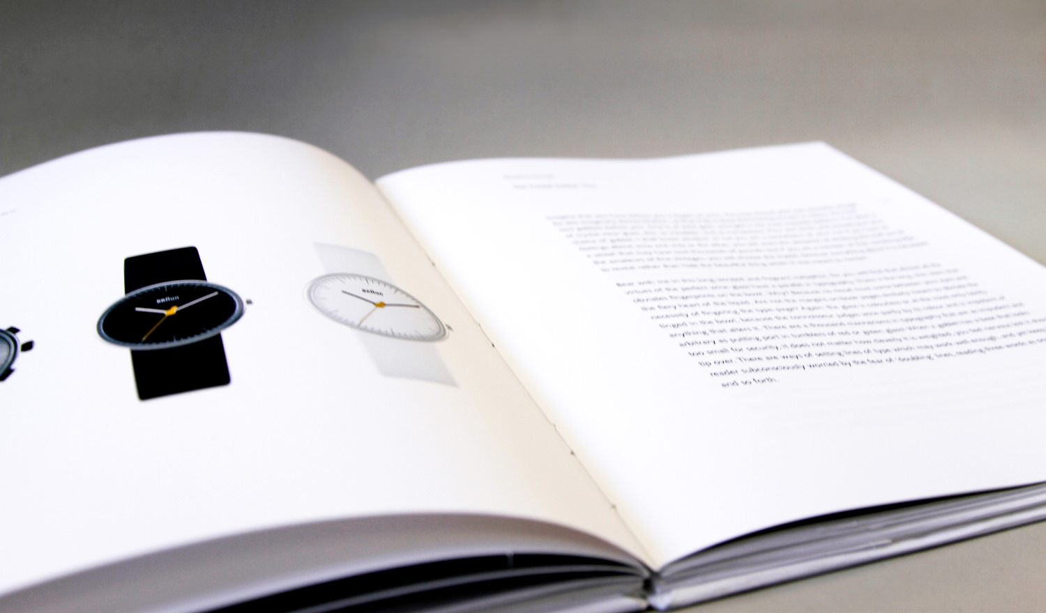
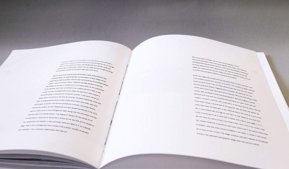
Creating rhythm and pace is my favorite part of book design. Knowing when to have a slow, quiet spread of only text, a loud pause, full-spread photograph, splash of color, a quick staccato peppering the spread with small darting images, followed by long clean lines of text and a large photograph, pushing scale to its extremes.
